Intro
A Rare Moment Materializes
In 2024 a rare moment materialized at Usana where there was space for me to dive into a part of the Usana experience that had never received much attention in the past. Commissions.
The Problem
Commissions
Commissions are a fearsome beast on their own, but they can quickly grow to unwieldy proportions when you consider the following:
Usana is a 30 year old company with lots of technical and UX debt, and is relatively new to design processes.
In 24 different markets across the world which have both unique rules for how commissions work and messaging that needs to be translated.
These rules and messages aren’t standardized and sometimes aren’t even documented at all, outside of being buried in code.
No one has ever attempted to visually represent these rules or figure out how to communicate them when contextually relevant.
We knew about all these things, but we didn’t know how truly beastly the problem at hand would be. With gusto, we dived in, determined to make something beautiful that had never been done before at Usana!
Exploration
But How Complex Is It Really?
After these initial conversations and exploration I realized that I needed some way to track and visualize all the differences across markets and complex rules that we needed to communicate to users. So I started putting together a chat to highlight the complex details across both individual markets and the system as a whole.
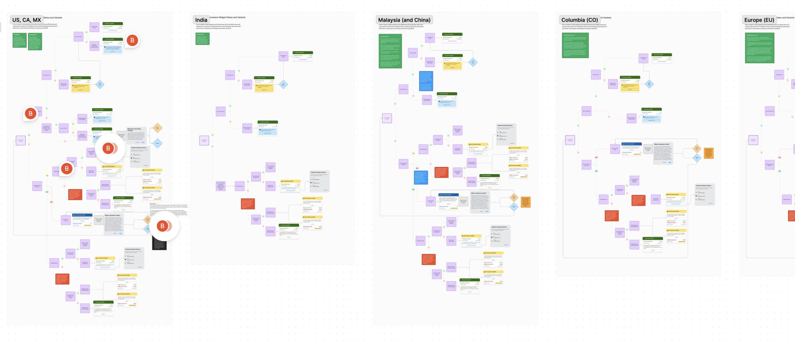
Not only did this really help me to prepare for designing such a complex experience, but it quickly became very popular with everyone involved. Both developers and stakeholders really liked how it communicated the complexity and broke it down for both the user experience and the backend logic and dependencies. Even though it was challenging to make I’m very proud of what it helped us accomplish together!
LoFi Design
Taking On The Complexity Burden
Highlighting the complexity of the current situation helped me communicate why changes like this were absolutely essential for Usana. I was able to focus the conversation and continued exploration around question like:
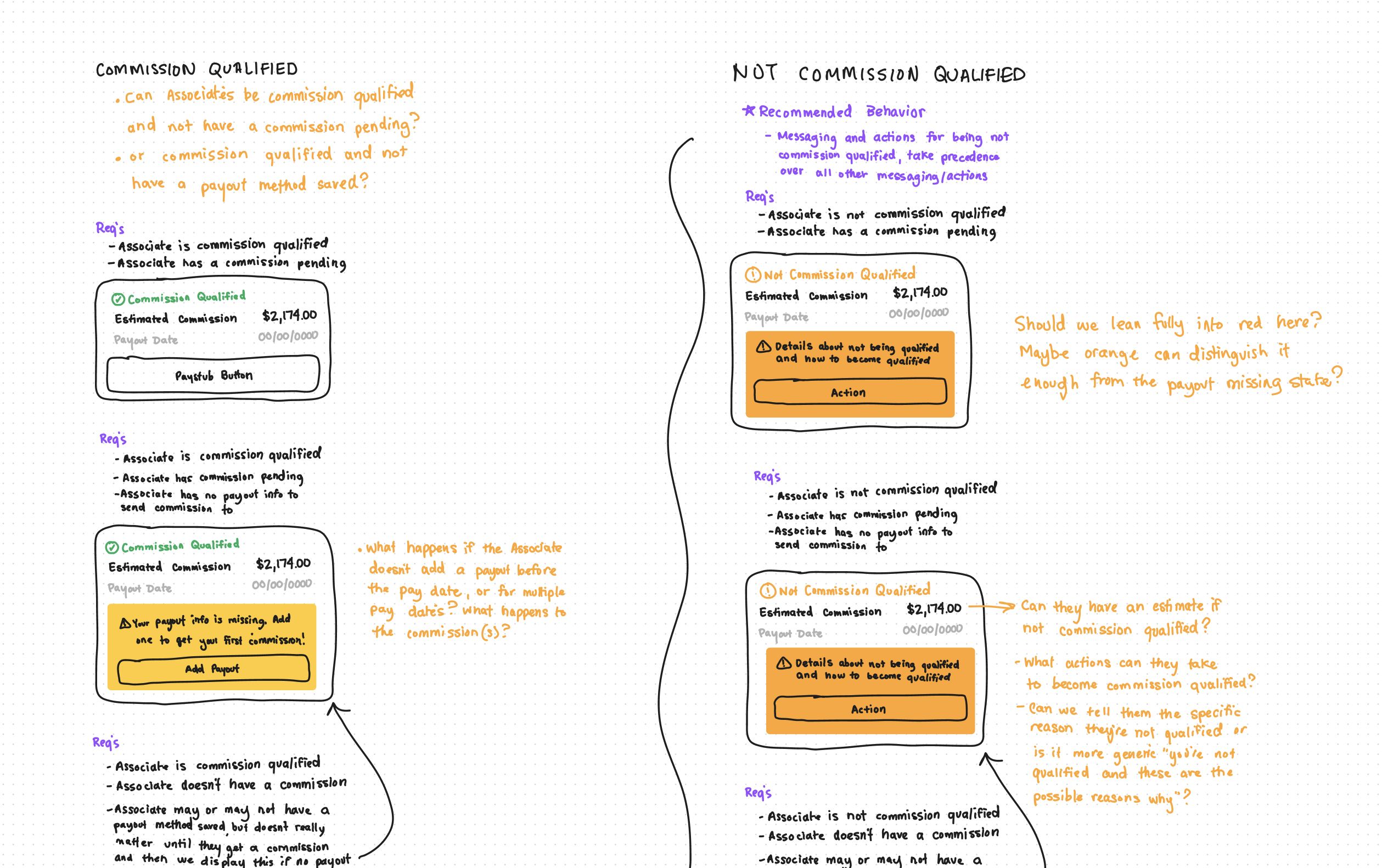
- As a user, why can’t I see quickly at a glance what my commissions are?
- If I’m not qualified to receive commissions, how will I know the reason?
- What action can I take to become qualified again?
- How can we, at Usana, remove barriers from this experience involving sensitive monetary info (especially when it’s already potentially stressful)?
Through the use of sketches and other visual artifacts (like the one below) I was able to dive deep into the lair of the beast to answer and explore these and many other questions.
HiFi Design
Using Design Assets As A Communication Tool
I discovered during this project how to put into words a piece of my design process that I love and find very helpful for myself and others.
I had been doing it on all of my projects, but didn’t know how to explain it. Instead of forcing my design opinions and ideas through completed designs that others didn’t get to share, I can use visual artifacts of all sorts to ask questions, highlight gaps or issues, and get other people talking and haring their own domain knowledge and expertise. They might notice something in my design that looks incomplete or is missing a piece of the puzzle and it will give them a chance to share. I think it’s a really beautiful way to discover and built together!
I find it really helps both me and others ask critical questions and calls attention to gaps or assumptions that we need to address or document for addressing later. It gives substance to a conversation that otherwise might feel elusive or challenging to define.
And with that understanding I continued sharing designs of many different types and levels of polish. Trying to communicate my ideas and help other people communicate theirs. Here’s one example that shows many different styles and possible ways we could communicate commissions with users. Some were terrible, but they still helped us refine towards what would be a great commission experience.
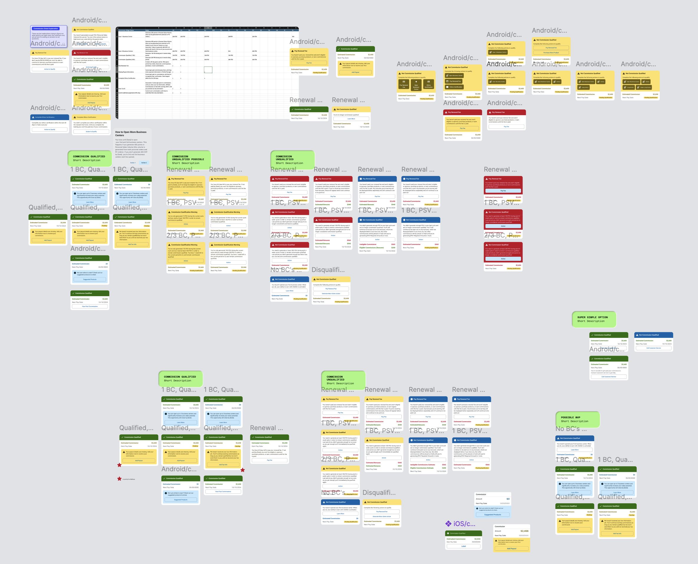
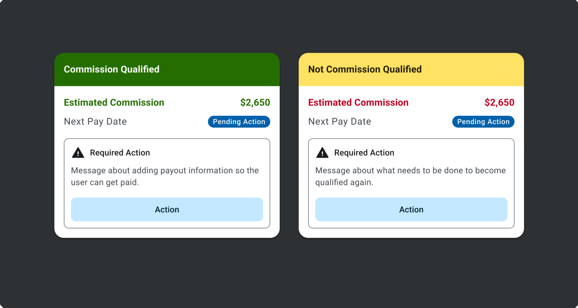
Through these conversations around visual assets we decided on a few core pieces of the commissions experience:
- Help the user see at a glance whether they’re commission qualified or not
- If not qualified, help them understand why and give them an action to take.
- If qualified, are there any other relevant messaging or actions they might need or want to take?
- Let the user quickly see at a glance their next commission amount and next pay date.
- If their commission are on hold for any reason, change the pay date to a status that indicates that change
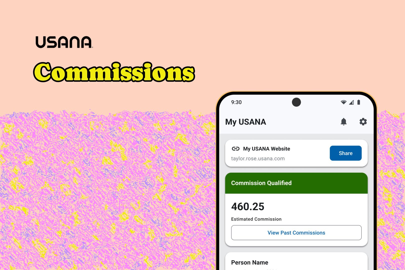
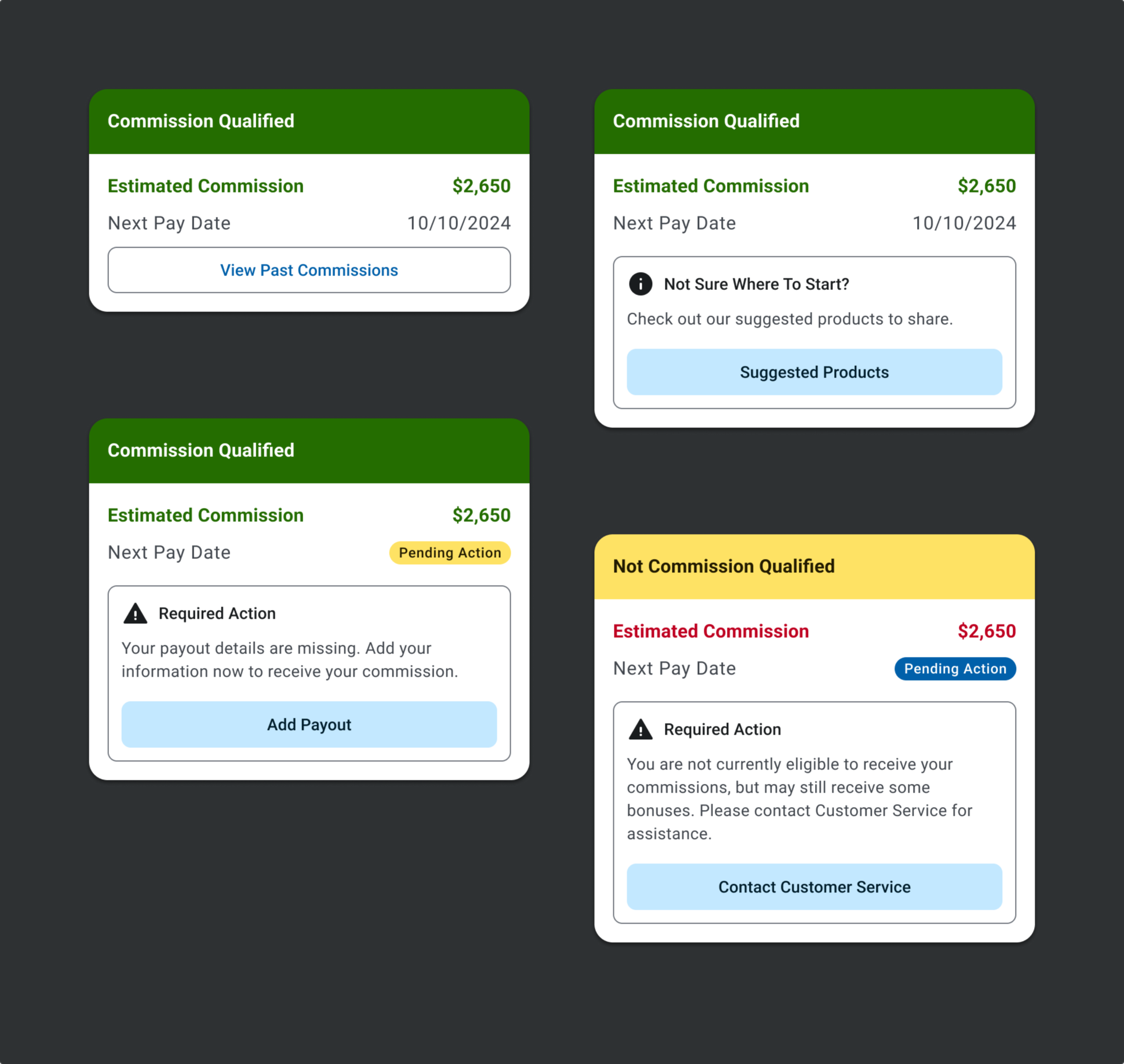
Here’s an early exploration of what that might look like:
We continued refining details and identifying specific messaging that might be helpful including a happy state and various states with differing emphasis and messaging.
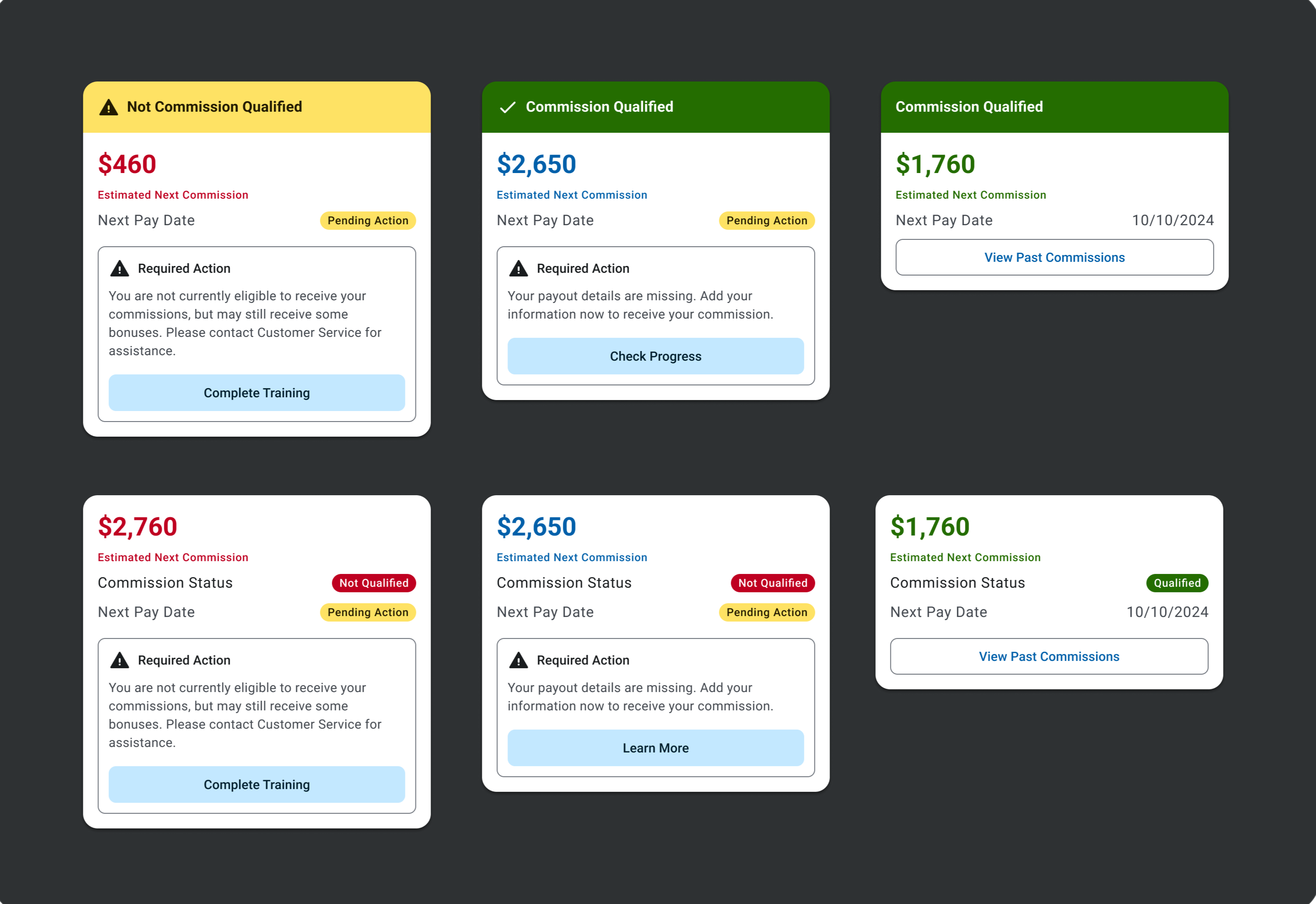
I also started working with one of our amazing UX Researchers to get some really scrappy research done. We weren’t officially approved for UX Research on this project so our resoibuurces were limited but we still felt it was valuable to get some feedback from people with domain knowledge. The testing was done with a very small group of internal employeesd after it was finished the UX Researcher and I made some adjustments resulting in the designs below.
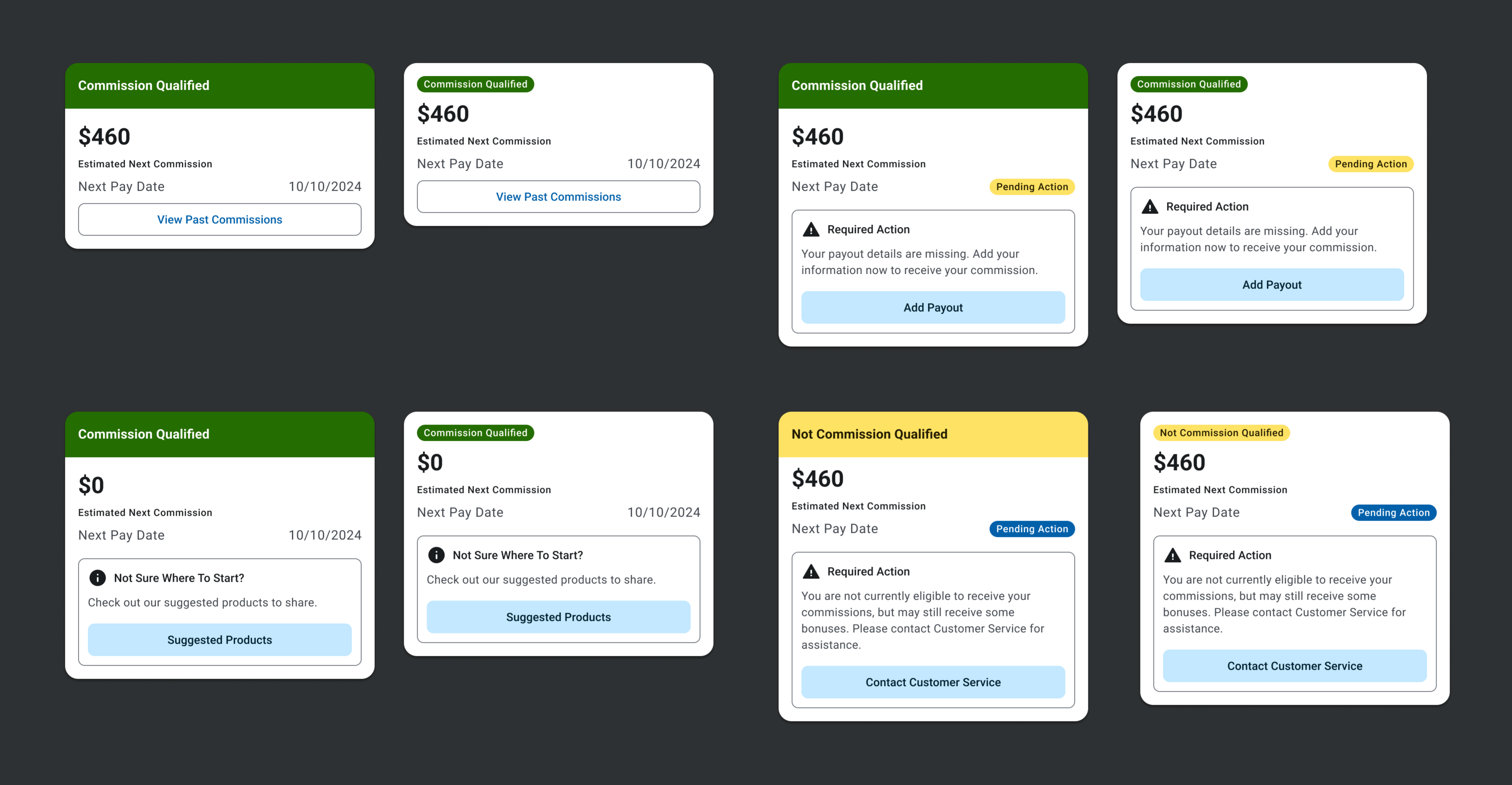
One final review with the whole UX team helped refine a few last pieces of the design, seen below. It definitely feels like the most polished version yet! The idea is that the large colored banner is displayed whenever someone’s qualification status changes, but if they remain in the status for a set time frame, it will swap to a less emphasized colored badge. This is to reduce the possibility of “banner blindness”, making the change in qualification status more impactful and noticeable.
After finalizing the design we reviewed a couple more times with developers and other stakeholders and prepared for launch!
Handoff & Cleanup
Building Systems Over Specific Solutions
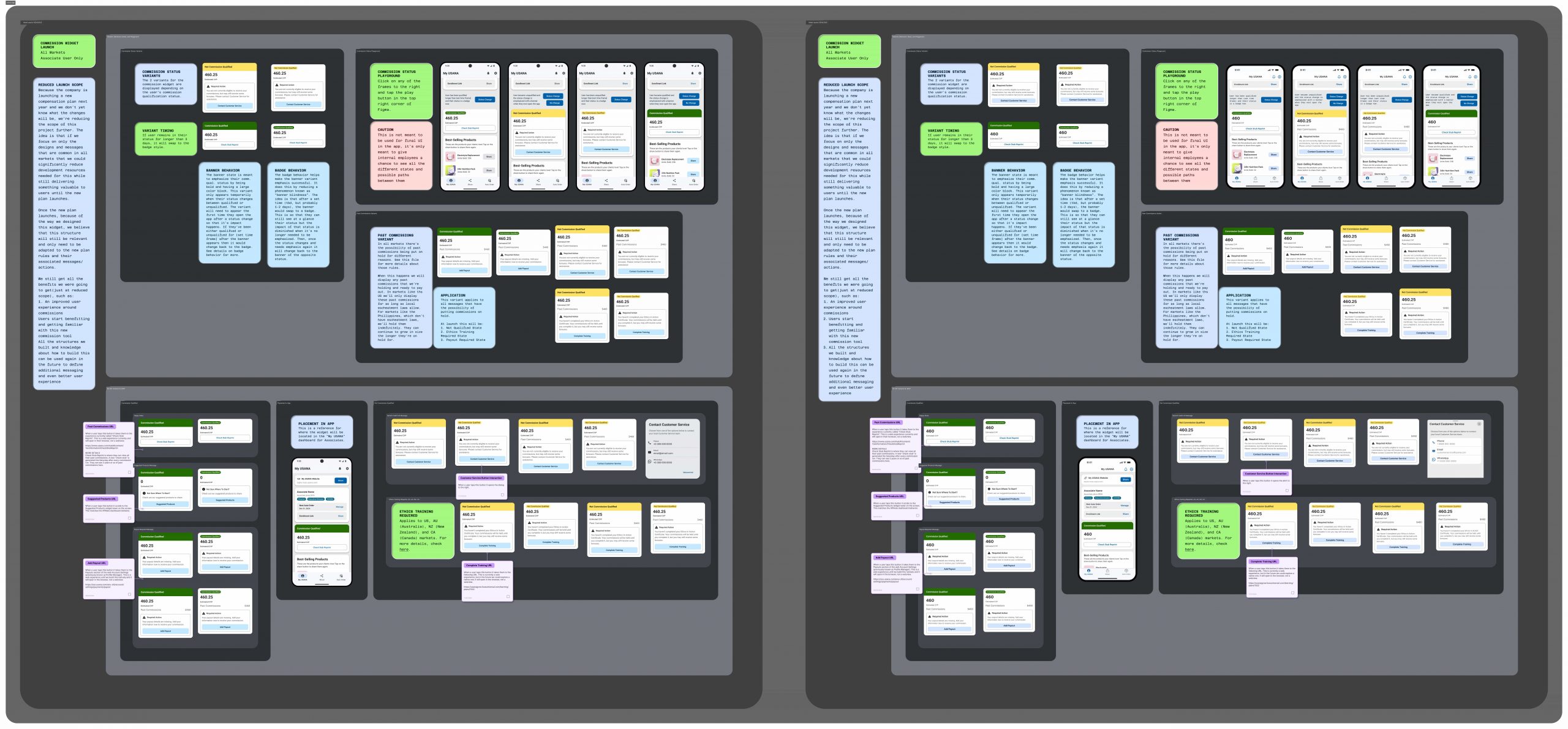
The initial launch for this is set to happen late spring 2025. Since finishing the full designs there’s been some unexpected changes at the company prompting us to scale back what launches. Although frustrating, we’ve been able to quickly adjust and none of the work we did is lost because we took the time to build a great foundation and I was very thoughtful about the design. All the designs above and core features will Even with a reduced initial feature set, users are going to start enjoying a much improved commissions experience that they’ve never had at Usana before.
Outro
Impact
Because this feature hasn’t launched yet, it’s difficult to measure the full impact on users, but the impact the project has had on the business has been huge!