Intro
For many years I’ve wondered why chatting with people has become so complex and furstrating. I wonder, why can’t it be like email where we all just talk no matter what platform, app, or service we prefer? There’s plenty of things about email that I definitely don’t want my chats to do, but that one things would be nice. So, when I stumbled on the Fediverse a few years back I was absolutely stoked about the idea of maybe a chat app being built on an open protocol like that. I really felt like it could stack up to the protocols like IMAP, SMTP, and soon to be JMAP that email uses. I was beyond stoked when I discovered that Daniel Supernault (AKA dansup) was working on just such a thing!! But at the time it was just a GitHub repo so I paused the idea since I couldn’t find anyone else even trying to approach the space. It was a big disappointment, but I didn’t want to try and build it since my coding skills are beyond mediocre. 😂 A couple years went by and I was very curious where things are at! I’ve been diving every deeper into the Open Social Web and it had been growing quite a bit. So I checked in again with the elusive chat app “sup”. Not much had happened, but this time I had an idea! If it hasn’t available yet, why not start setting some of the foundational design work. The architecture, the branding, and other pieces that would help it be really polished when the development started?? So I did, and who knows, maybe it would even turn into something real if I could get dansup to take a look at it? (Spoiler, he did!)
Exploration
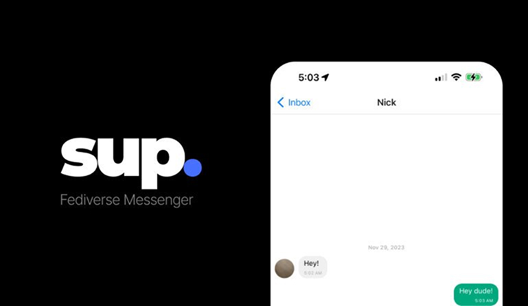
I really liked the accented period from the current sup wordmark (seen to the left) and that it was highlighted in blue.
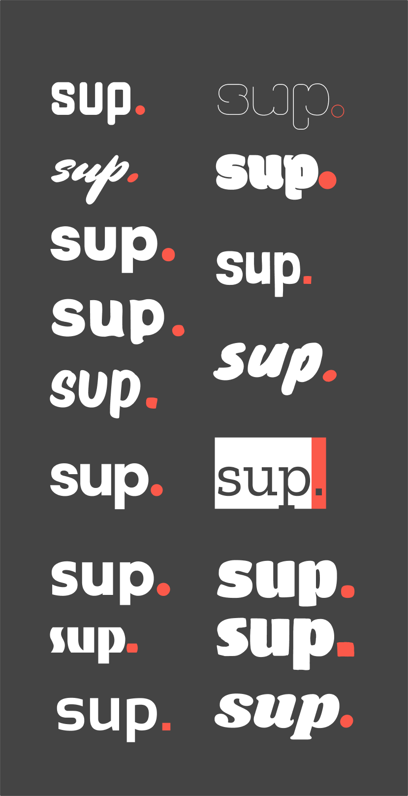
I wanted to see if I could push it a bit further to make it more bold and I explored a bunch of different fonts as well as a new reddish color that I felt matched the purple-ish blue of the period in the original wordmark.
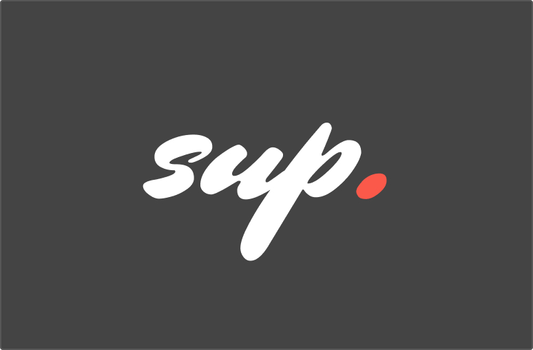
I found the font “Mrs Sheppards” and it felt like a really great match for the street/artsy/scrappy aesthetic I was going for. The selling point for me was the slightly oblong period.
I started exploring how I might be able to incorporate into a logo. Since I really loved that oblong period, I explore lots of different ways I might use it in the design. Here’s some of the things I explored:
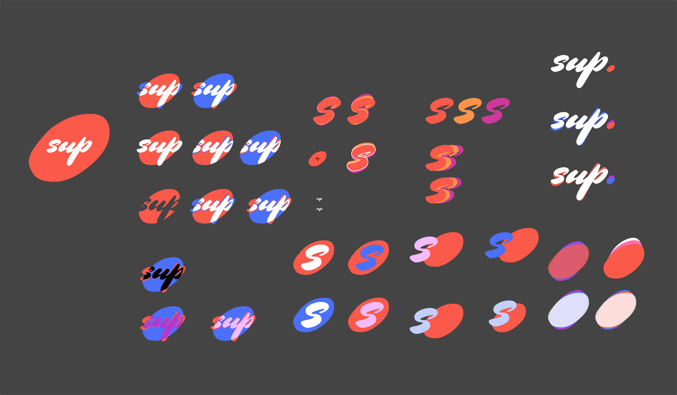
Then I struck gold (or at least it felt that way to me). 😏 I realized why not use that beautiful oblong period shape from the wordmark and turn it into a chat bubble??
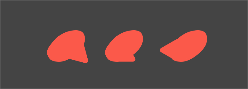
The first and third options were pretty awful, but the second showed promise so I kept exploring.
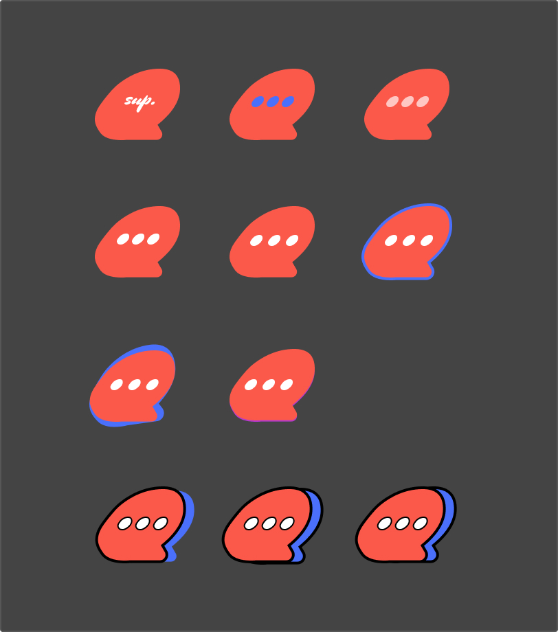
Outro
For a quick branding project, I was really satisfied with what I was able to create! I’ll share more details about the project soon including the app designs and an interactive prototype I built, but this is plenty for now.
👀 Spoiler 👀 After creating this and some stuff for Loops, I shared with dansup and he invited me to join the team!! I was absolutely stoked because I’ve been trying to connect with multiple open source projects over the last year and hadn’t been able to until now! 😻
