Intro
The Unexpected Showdown
Suddenly, our team faced an unexpected deadline. The product sharing app’s core software was about to be shutdown, and it was a highly used mobile app feature. I led the effort to not only replace but improve mobile product sharing at Usana. It was a tale for the storybooks, proving that solid design practices and processes create the best digital experiences, even in unexpected circumstances. 😉
The Problem
Product Sharing Features Weren’t Ready
An old app housed the product sharing features, and was going to be deprecated unexpectedly. It was built using a technology called Xamarin, and Microsoft (the owner of Xamarin) was shutting the technology down in less than a year.
We unexpectedly needed to design and develop a new product sharing experience and only had about 6 months
On one hand, we were very happy because the app was both difficult to maintain and not a good look for the brand. On the other hand, we were hoping to focus on other feature sets in the new app, like shopping. Regardless, we pushed those dreams aside to make way for this imminent change!
Exploration
Possibilities & Constraints
App Audit
I started by auditing the current experience. I was pretty confident that many changes would be needed but wanted to validate my assumptions. Unfortunately, there wasn’t much documentation for the previous app, but combining what we had with the live/prod app I was able to pull together enough details to get a feel for where things were at.
After finishing my dive and talking with developers and stakeholders along the way, I came away with a few core takeaways.
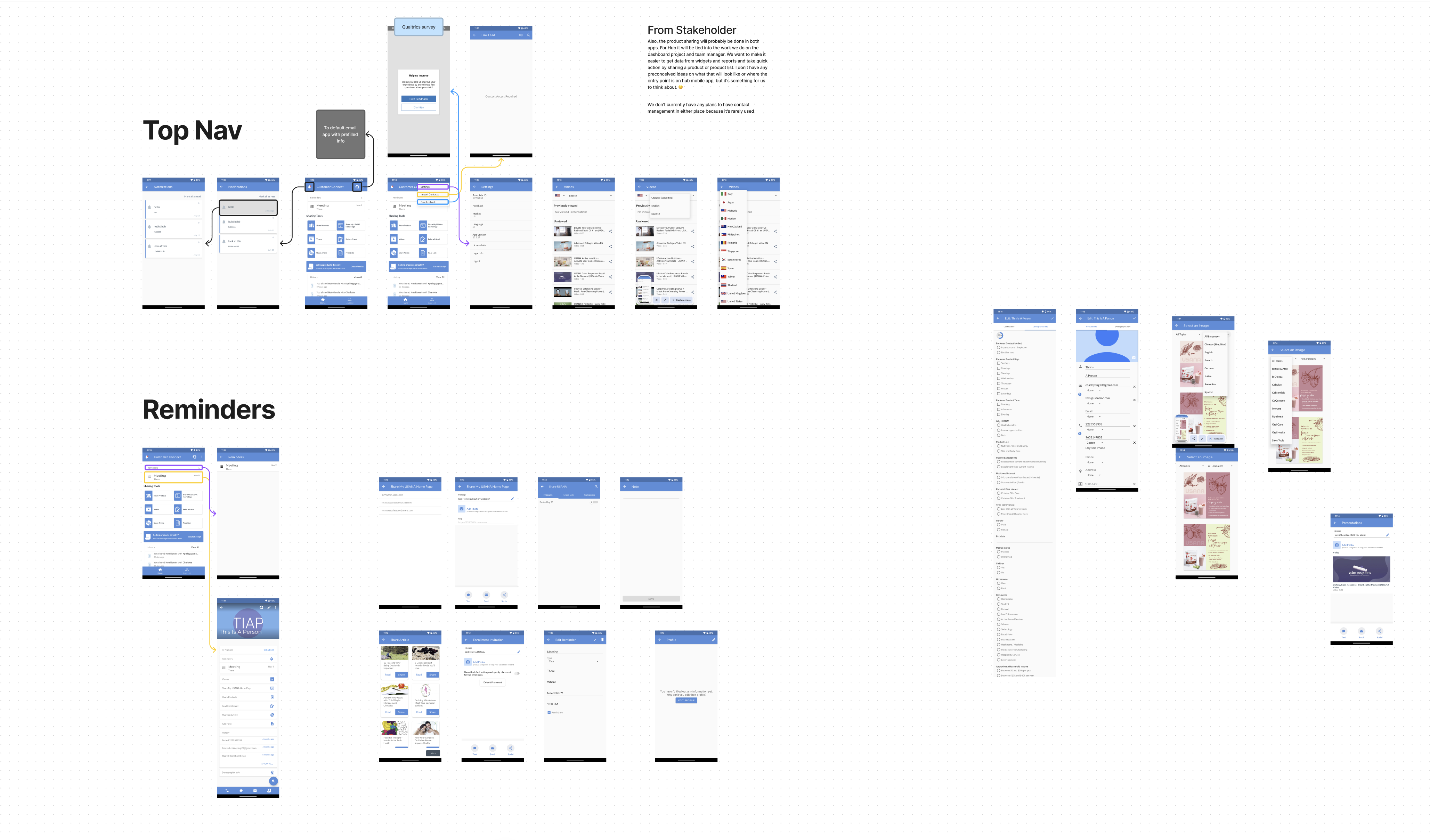
Information Architecture Flows
With these ideas in mind I started creating flows. I like using visual artifacts to share what’s in my head and help other people share what’s in theirs. In this way we work towards alignment on the direction of the project. I do this at every step of the design process, but during these early stages I feel it’s much more critical in establishing a strong foundation for the project.
While reviewing the flows with the developers and stakeholders I focused on 3 key areas that would have the highest impact on both the user experience and developer experience.
The discussions were a big success and everyone agreed on the focus areas and things I called out! We all felt like we had a strong, cohesive vision for the project, and this alignment was pivotal to move into LoFi designs with clarity and purpose.
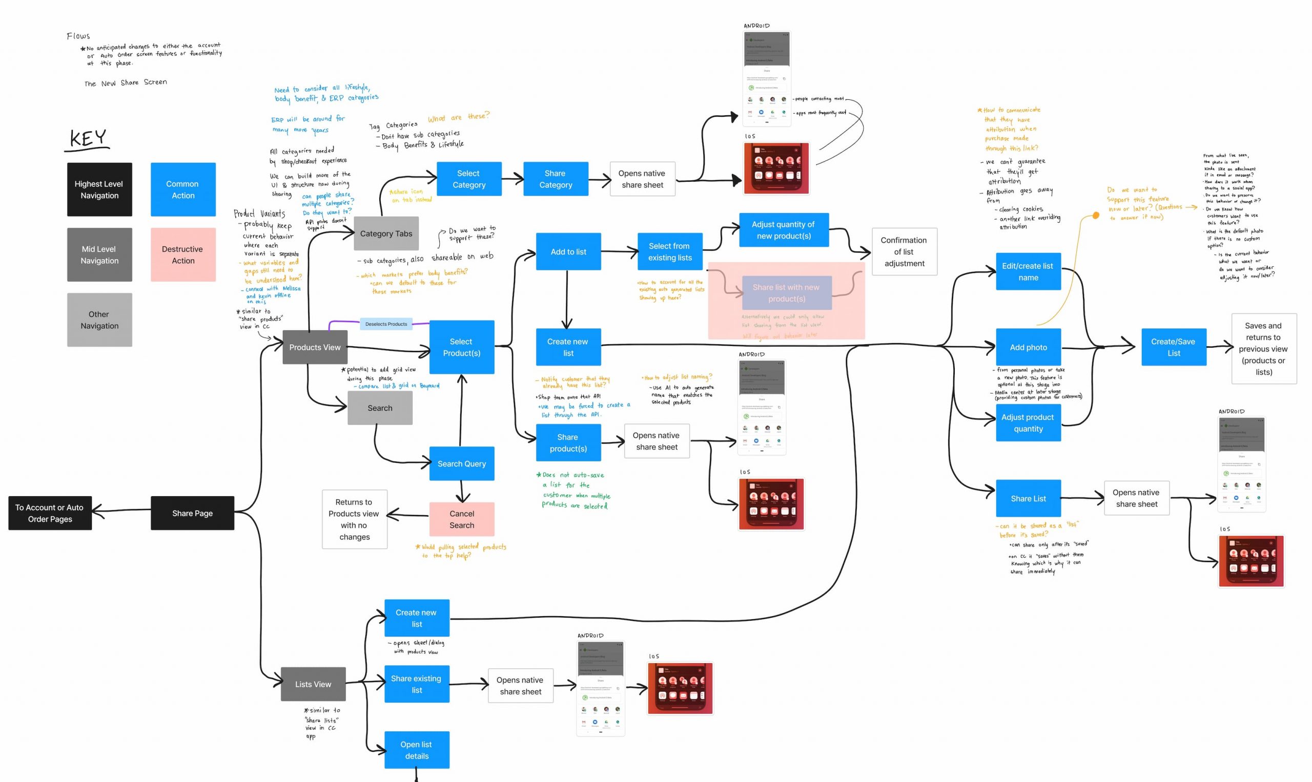
LoFi Design
Back To Some Product Basics
Holistic Information Architecture
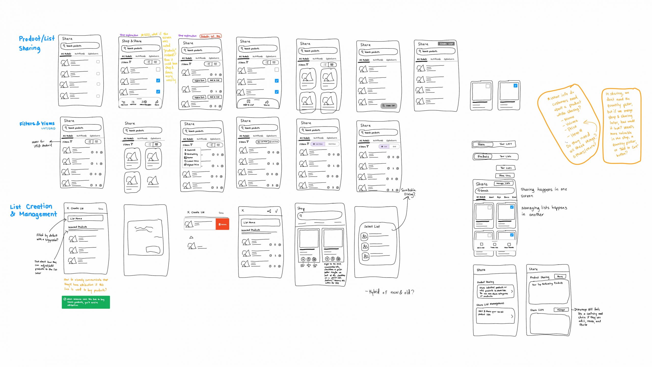
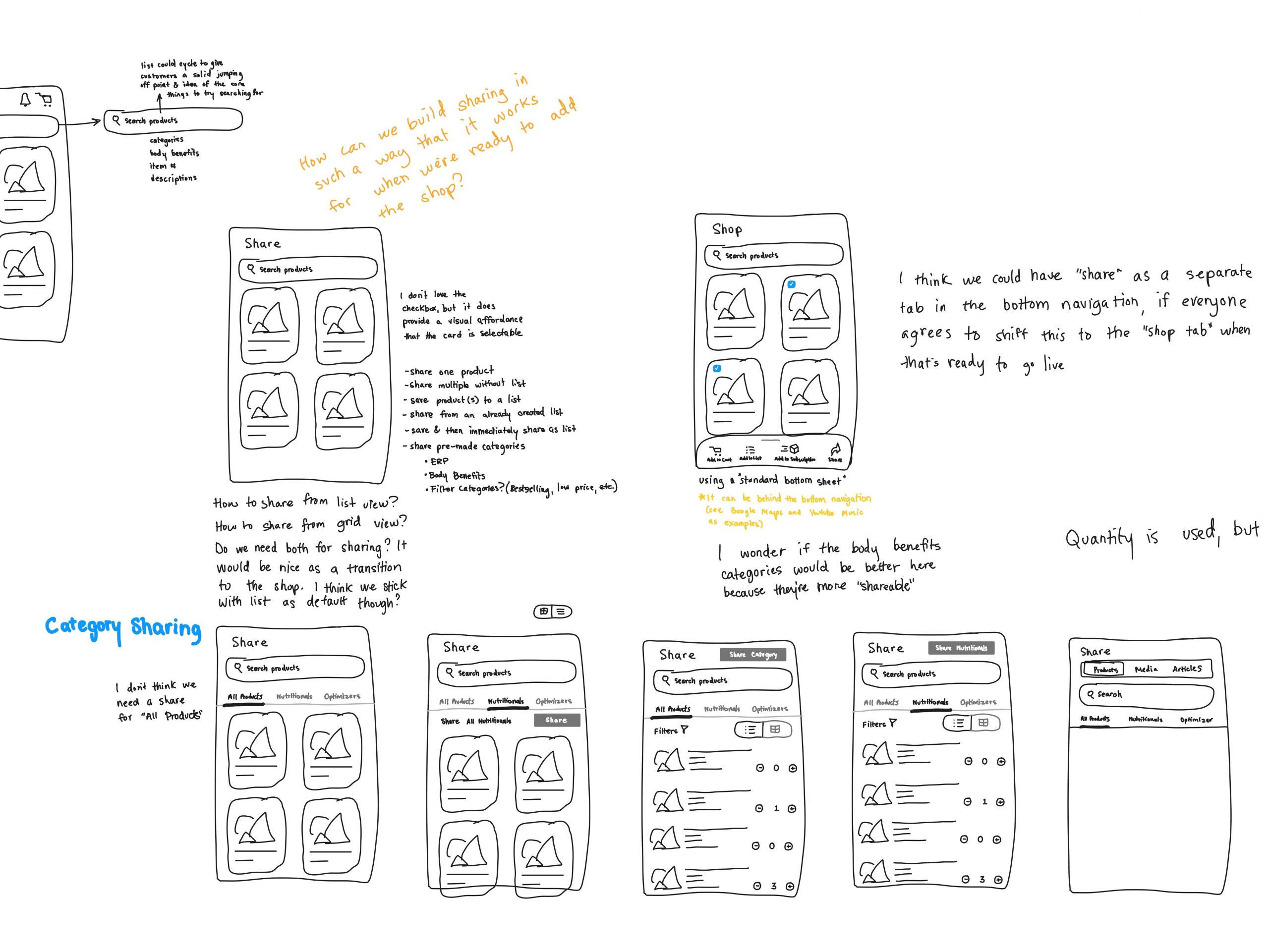
While sketching I ensured we were thinking holistically about the app experience to avoid 2 things: scope creep and “painting ourselves into a corner”. One example of this can be seen in the image below where I explored how we might support both shopping (a future feature set) and sharing (the current feature set).
Because they are both very important product related actions, they needed to be considered together at this stage to ensure we were setting ourselves up for future success. However, we also needed to make sure that the system was flexible enough for future discoveries and that it didn’t paralyze us from finishing the product sharing designs.
While sketching and sharing them with others I would ask questions like:
Could shopping and sharing exist in the same space or do they need their own spaces?
How could we structure sub-navigation elements like product categories to support all product related features?
What could we do now to prepare both the user experience and technical foundations to be strong and long lasting?
What would the intermediary steps be to support product sharing until the full feature set was ready?
Thinking broadly about the app and talking openly with developers and stakeholders allowed us to reduce technical and UX debt and create a reliable experience that people could enjoy now and not need to relearn when new features launch.
Product Sharing & Lists
What’s the difference between product sharing and product lists and why am I making a big deal out of it?
Product Sharing
As simple as sending a product link to someone from your favorite online shopping platform.
Product Lists
Think of product lists as a group of products you save to use multiple times. Similar to “Favorites”.
In theory these lists could be used for any product related task (like adding to cart, subscribing, or sharing them with others). In reality, product lists at Usana can only be shared with others (for now). But the current implementation was causing issues that we needed to address before the upated Product Sharing experience launched
Why is this a big deal? And example of how this might go can be seen below.
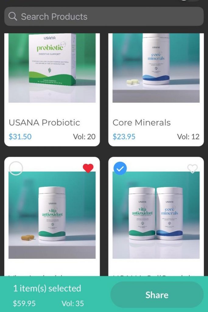
After a selection of one or multiple products, if the “Share” button was tapped it would create a list with a default name applied. But what if the user didn’t want to save a list? What if they just wanted to share products on-the-fly? After a while, these lists also start to clog up and make it difficult for users to find the lists they did actually want to save.
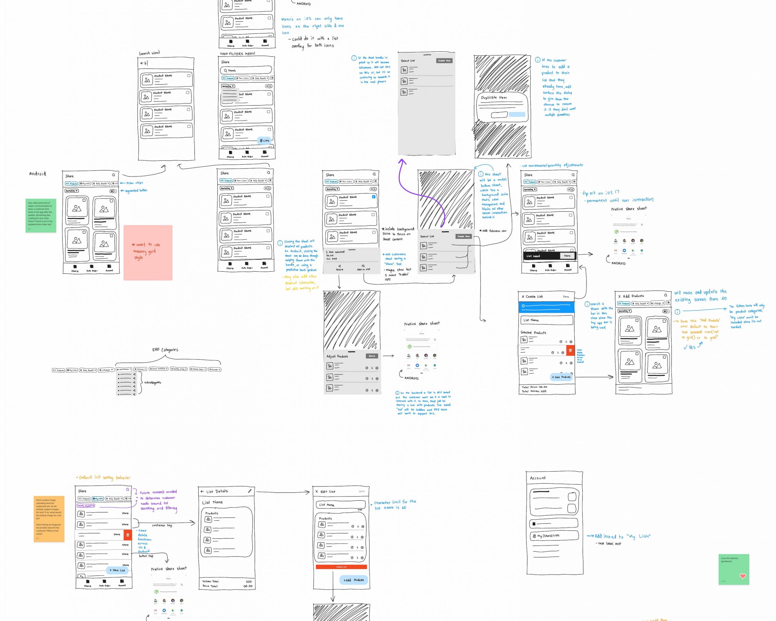
I created many different sketches to explore how we could more clearly differentiate between these 2 actions and other improvements to product sharing. I used the sketches to communicate with others on the project different ways we might achieve our goals and specifically why the change for product lists would be so valuable to make.
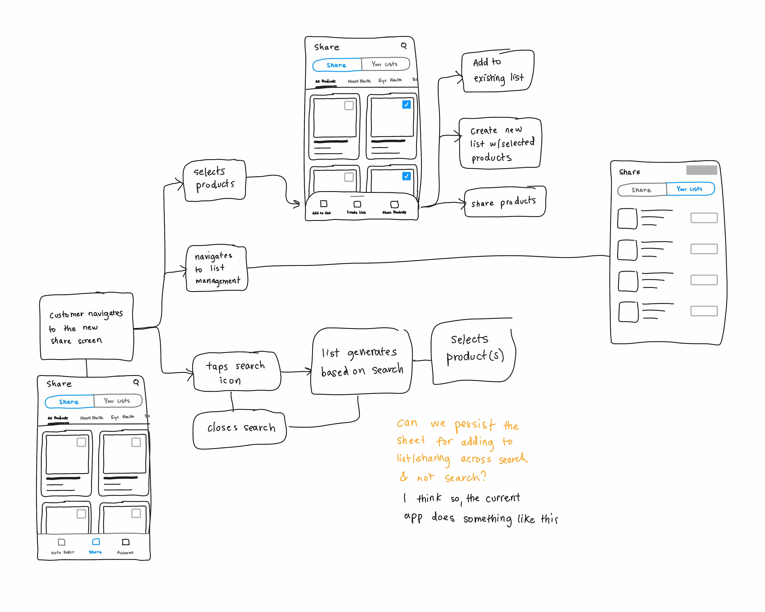
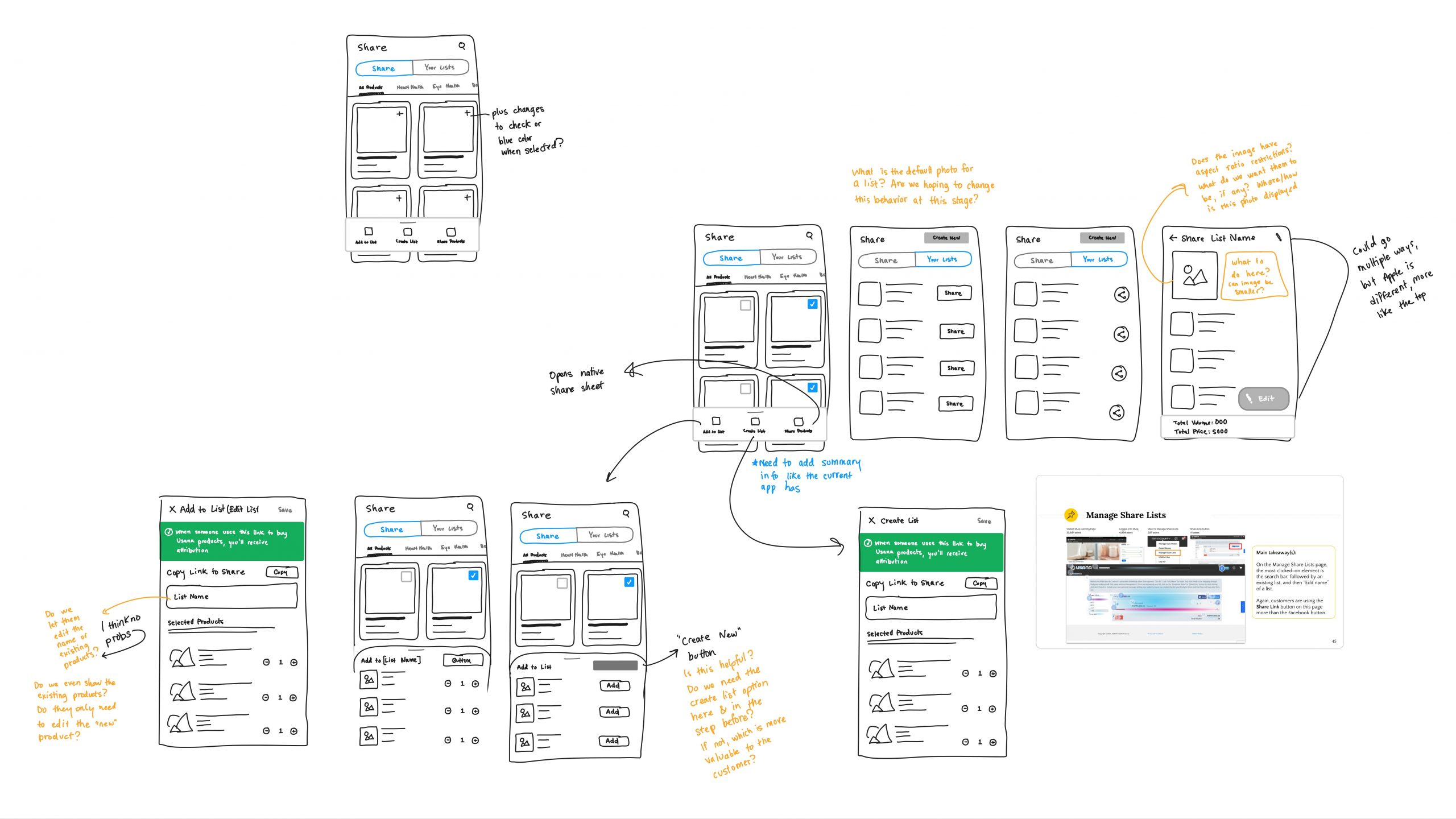
Thankfully, after sharing the sketches, everyone was on board to give the power back to the users! This meant that they could choose how to share their products and when and that we were no longer forcing list creation on them when they didn’t ask.
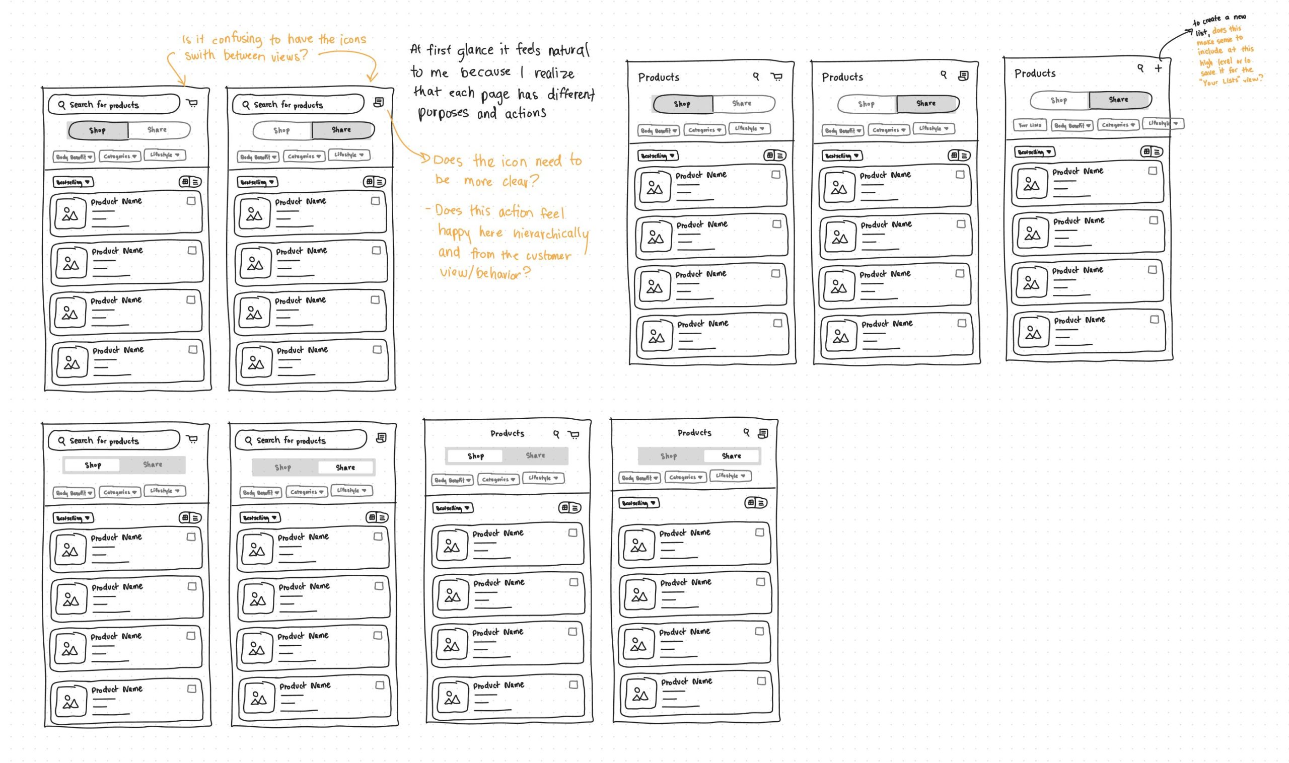
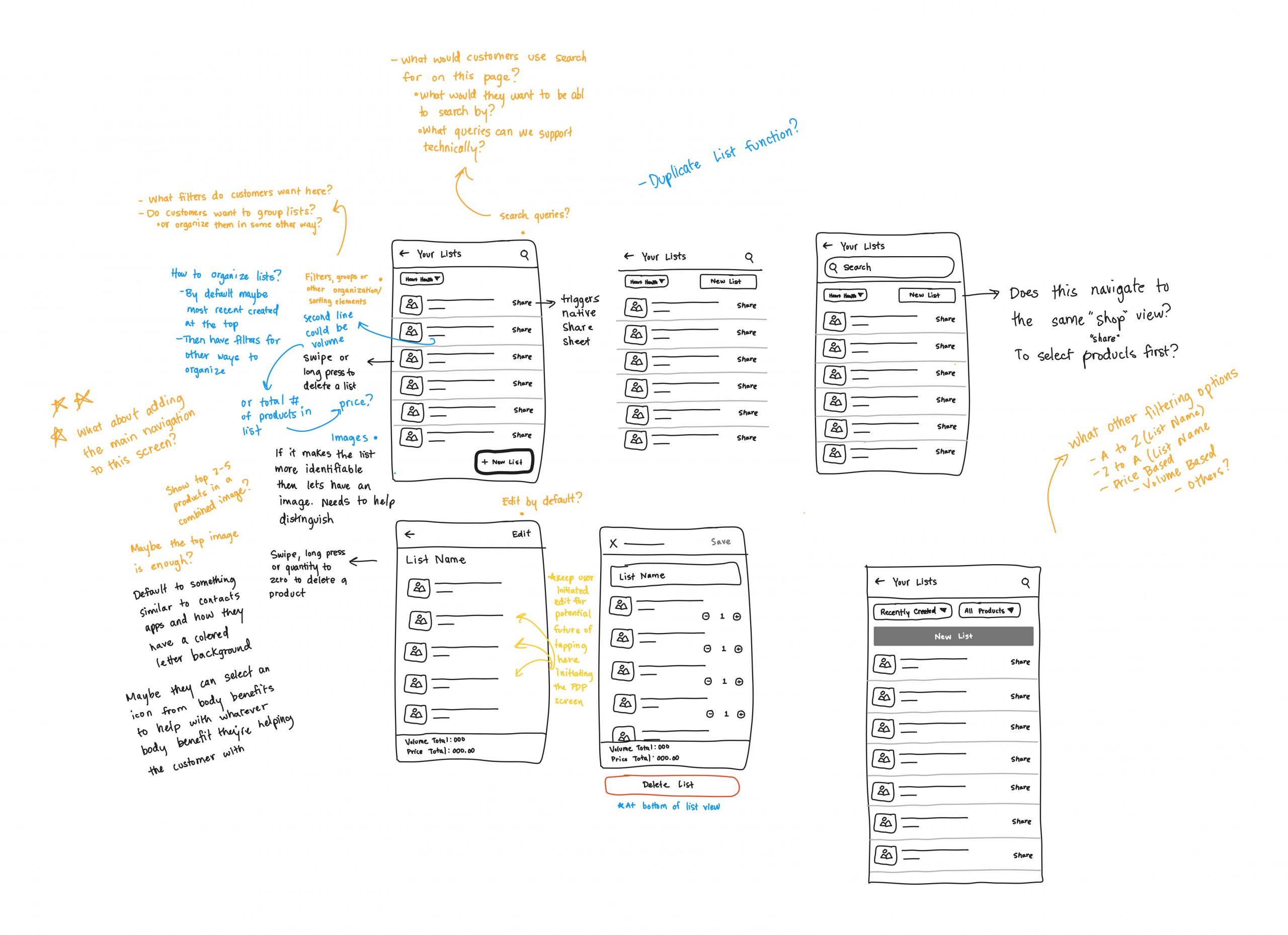
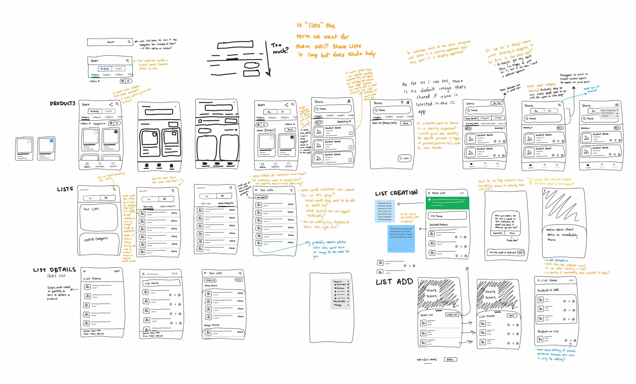
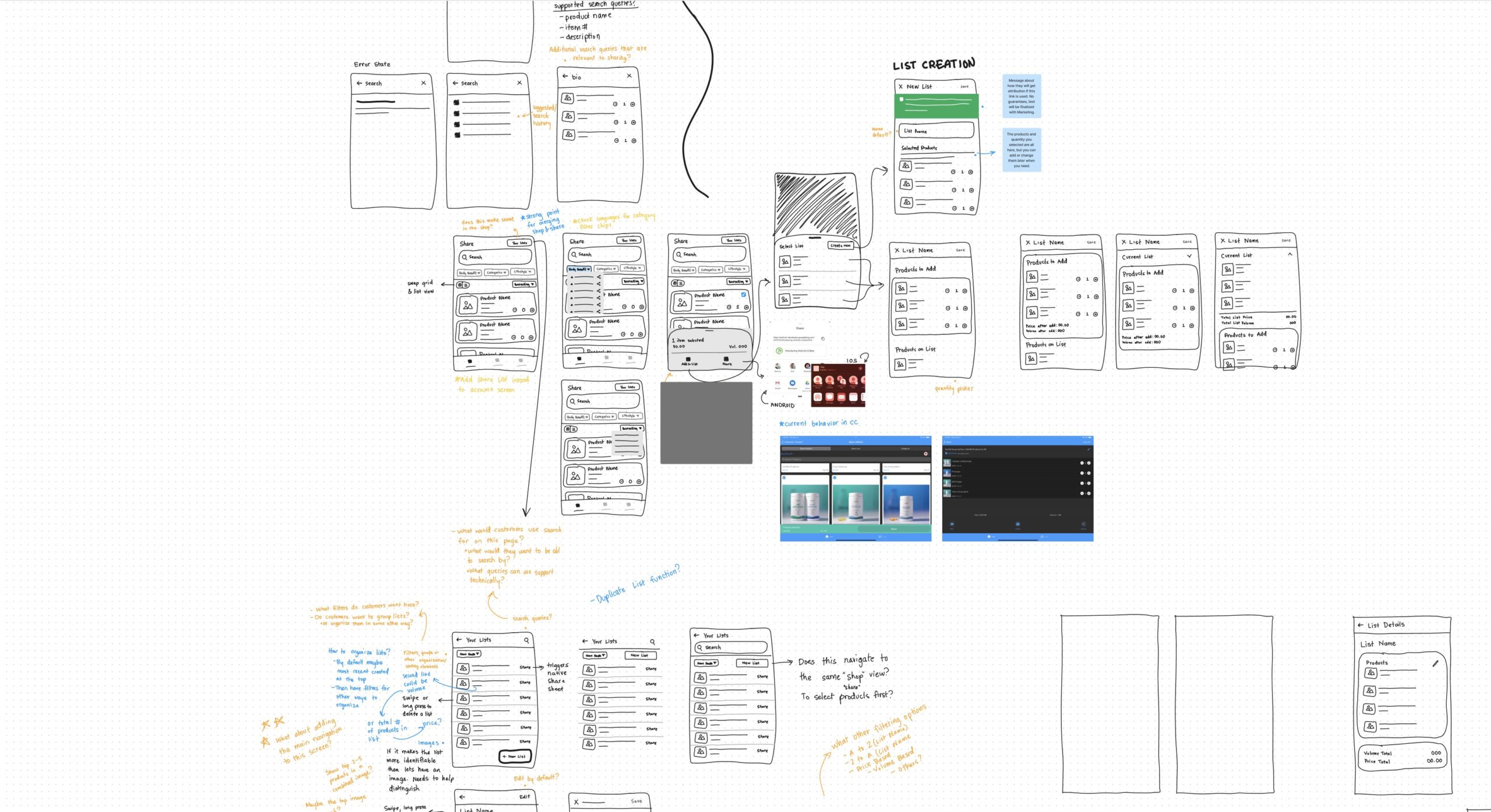
More Sketches
Here’s a few more of the concepts and ideas that were explored to hone the product sharing experience, communicate with stakeholders and devs, and prepare for high fidelity designs.
HiFi Design
The Magic Of Prototypes & Native OS Tech
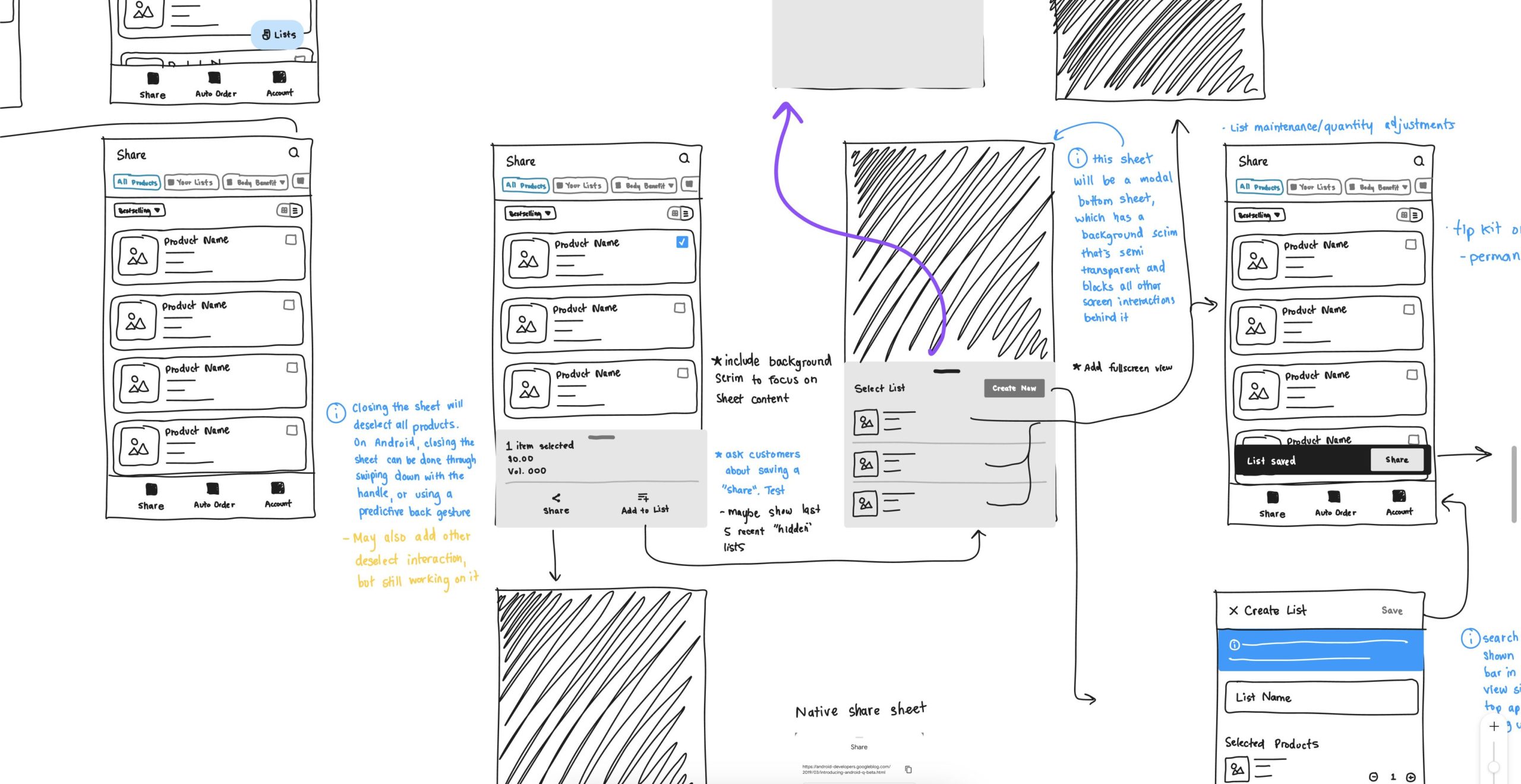
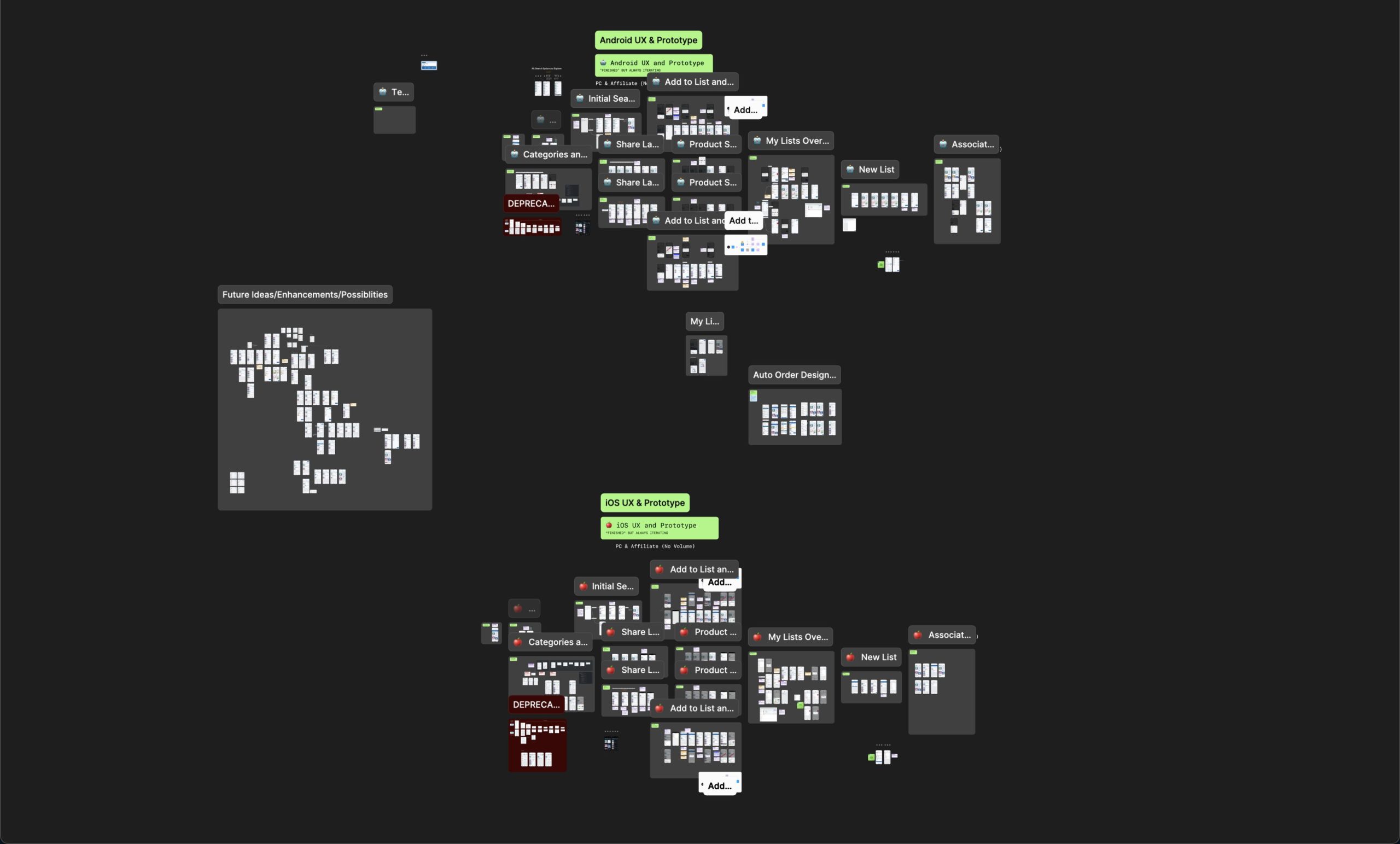
I had been pushing for us to switch to Figma since I started working at Usana and this was the first project after we made the switch (so I was stoked!). This allowed me to improve file organization with sections, notes, and more details that would help devs and stakeholders. Example below.
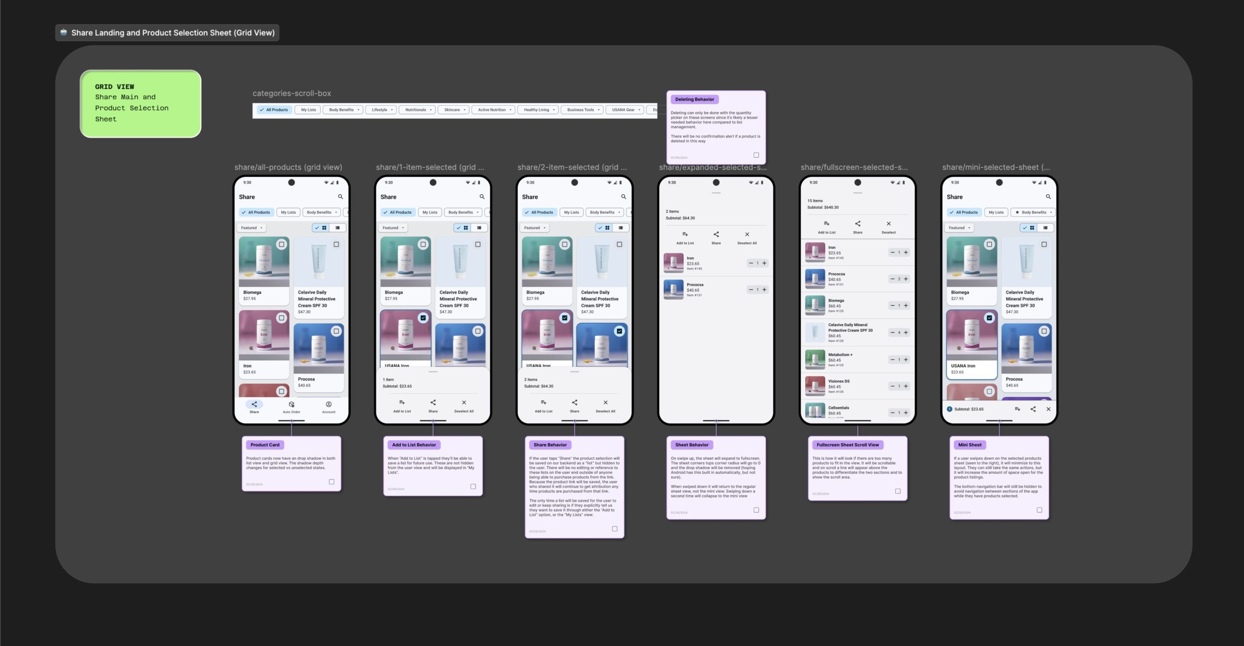
I was also able to finally build a really solid component kit using my favorite Figma features like Auto Layout, and start building prototypes! 🤩 All of these things combined to really help step up our level of polish, coordination, and project solidity.
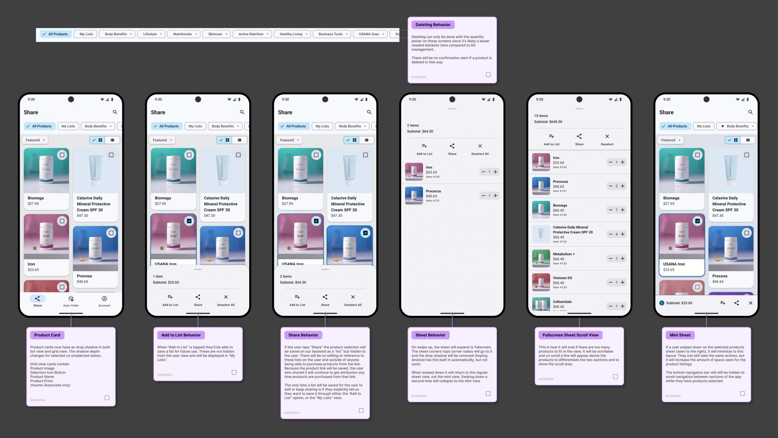
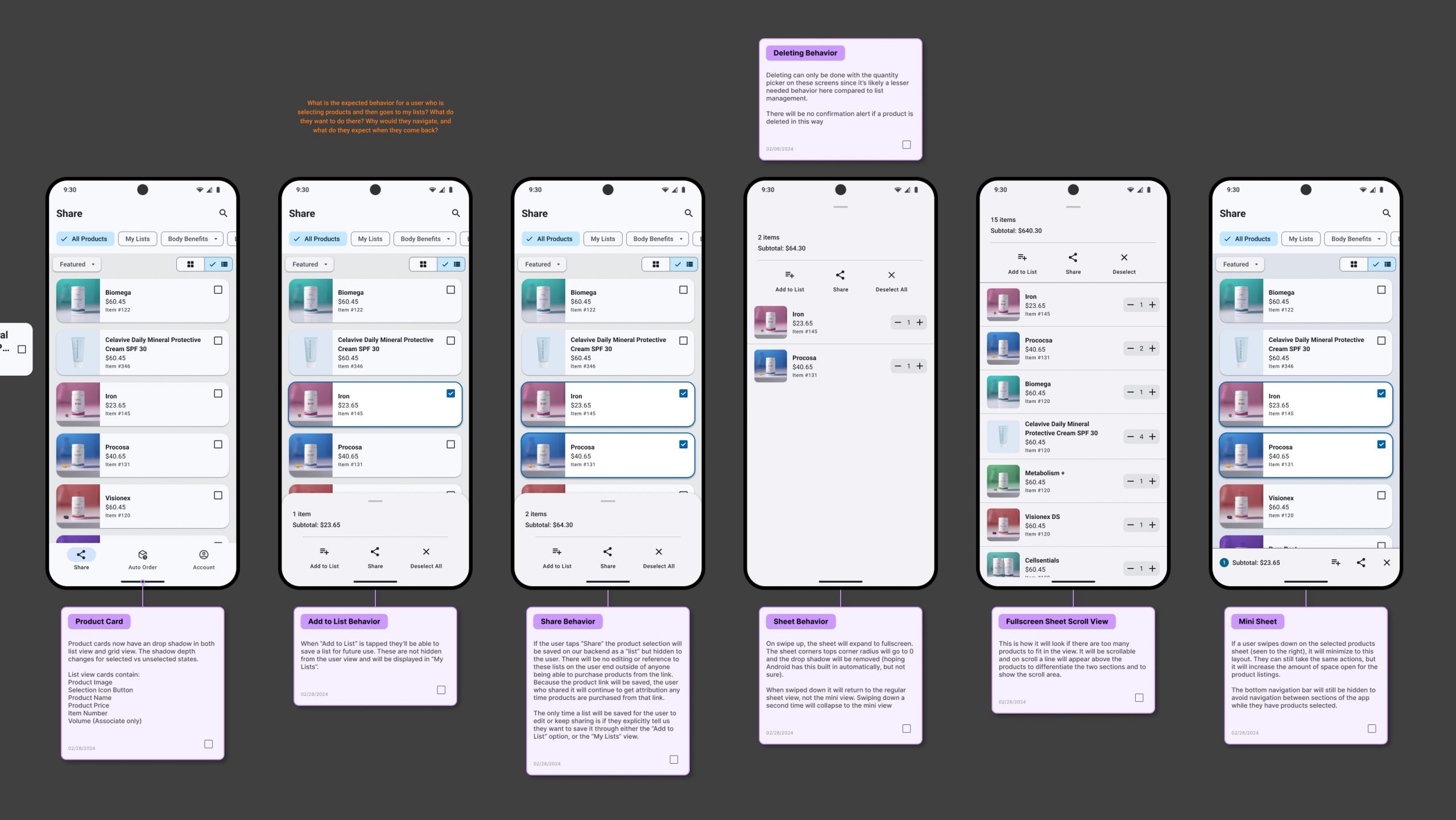
The Magic of Prototypes
Here’s a few pieces of the prototype I created for product sharing broken up into different feature sets. I’ll swap between iOS and Android so you can get a feel for both.
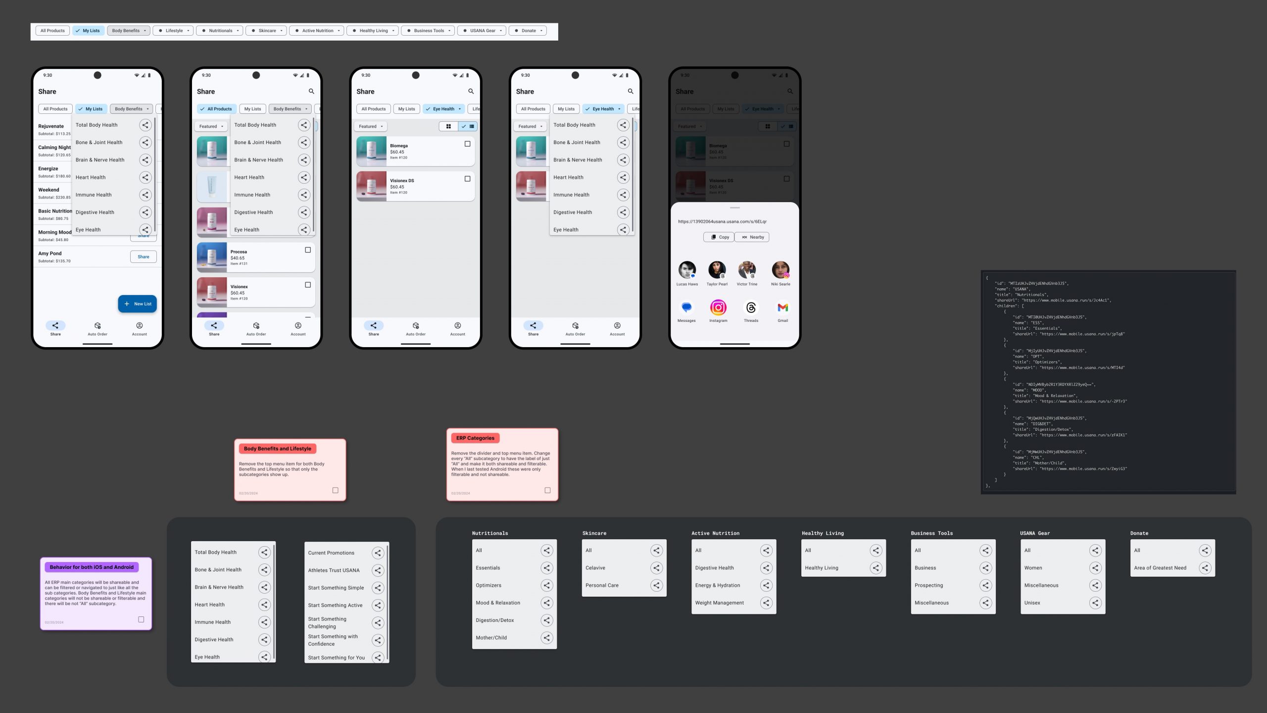
Navigation & Menu’s
Showcasing functionality of category navigation, list and grid view, and the category menu’s.
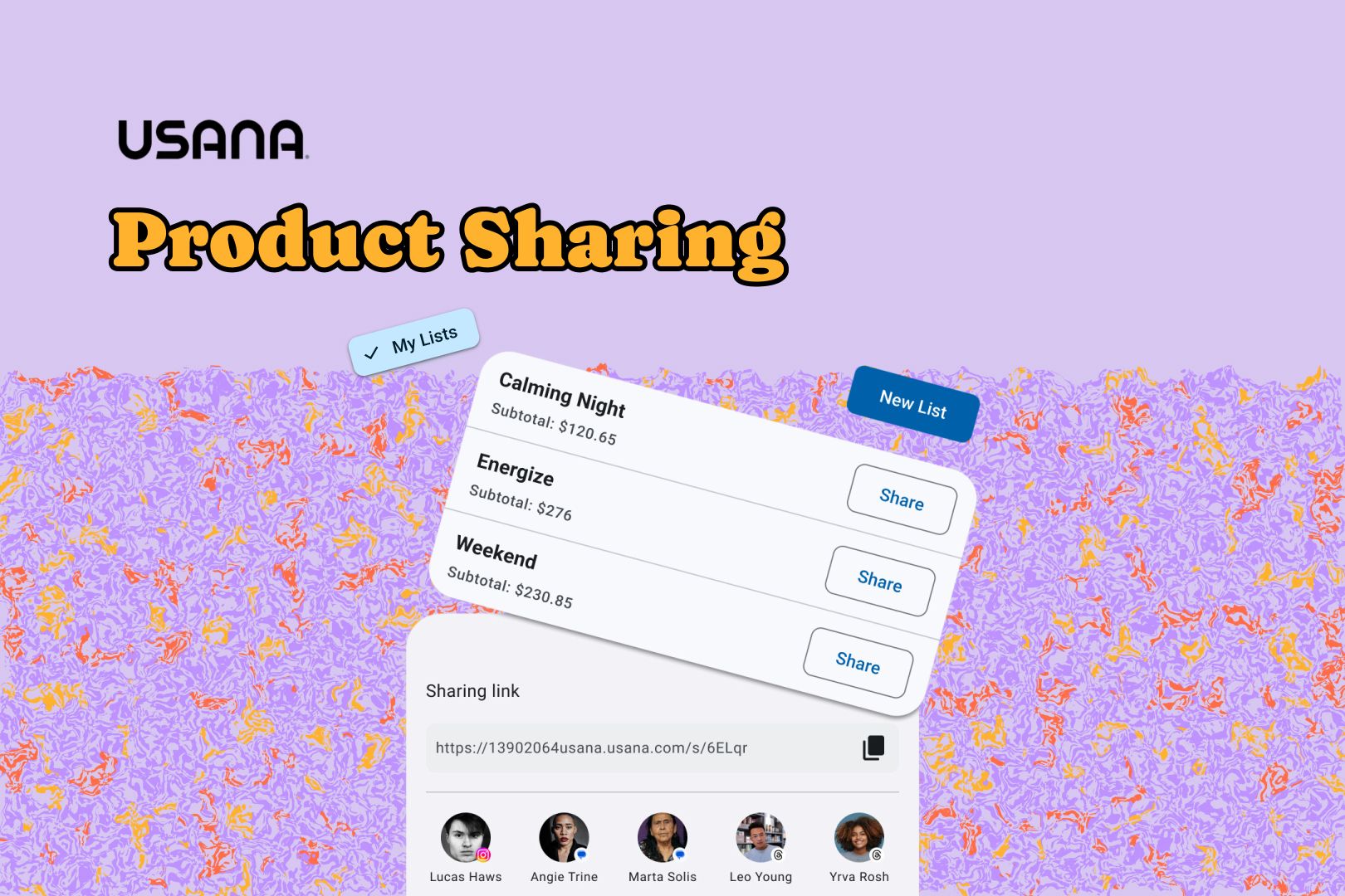
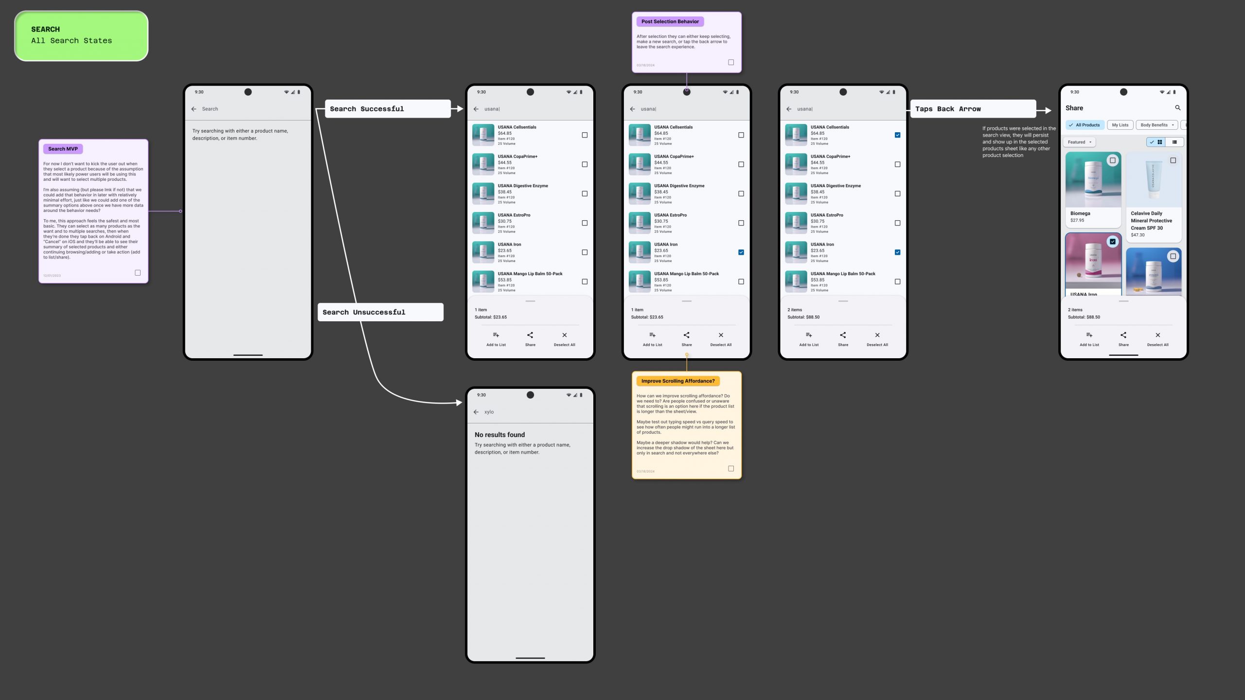
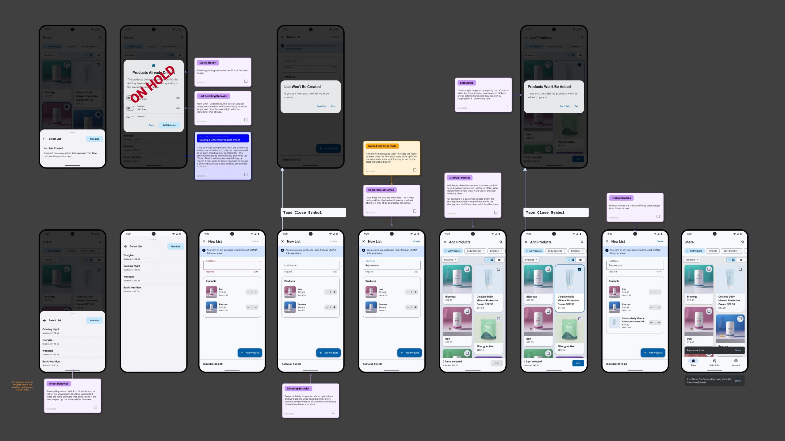
Product Lists
Showcasing functionality of product lists and where they’re located within the app hierarchy.
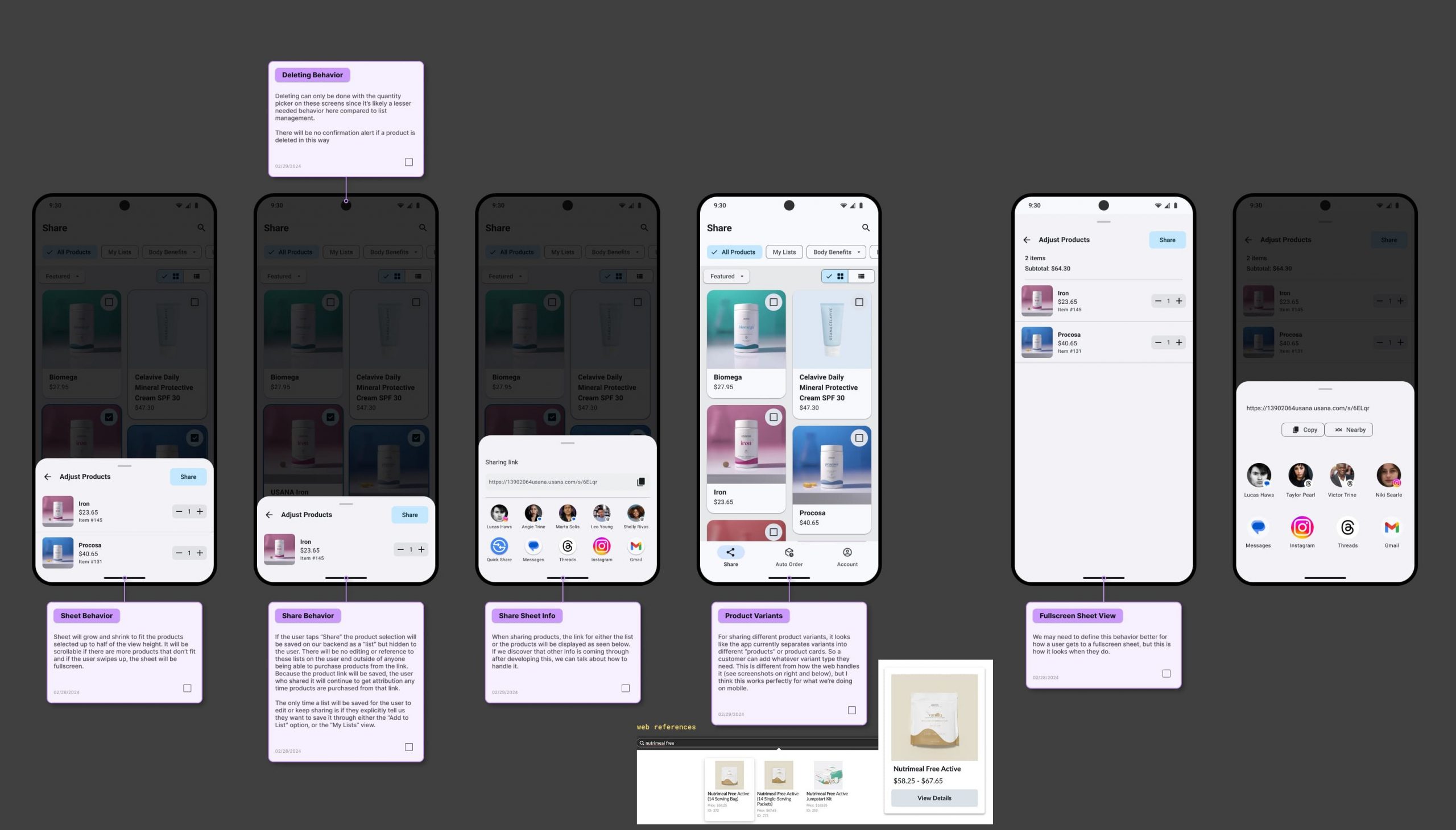
Sharing Interactions
Showcasing sharing products and adding products to a list.
For some reason interactive design prototypes aren’t something people used much at Usana. Although I know they’re a decent chunk of work to set up, they can be built in to the design process to minimize that work and the value return is immense. Here’s the main reasons I prioritize creating prototypes as much as possible.
Whatever the reasoning is for a lack of prototypes at Usana, it was really fun to blaze new trails and showcase how awesome design can be! ✨ The devs and other stakeholders really enjoyed using the prototype during this project and I hope it catches on more in the future at Usana.
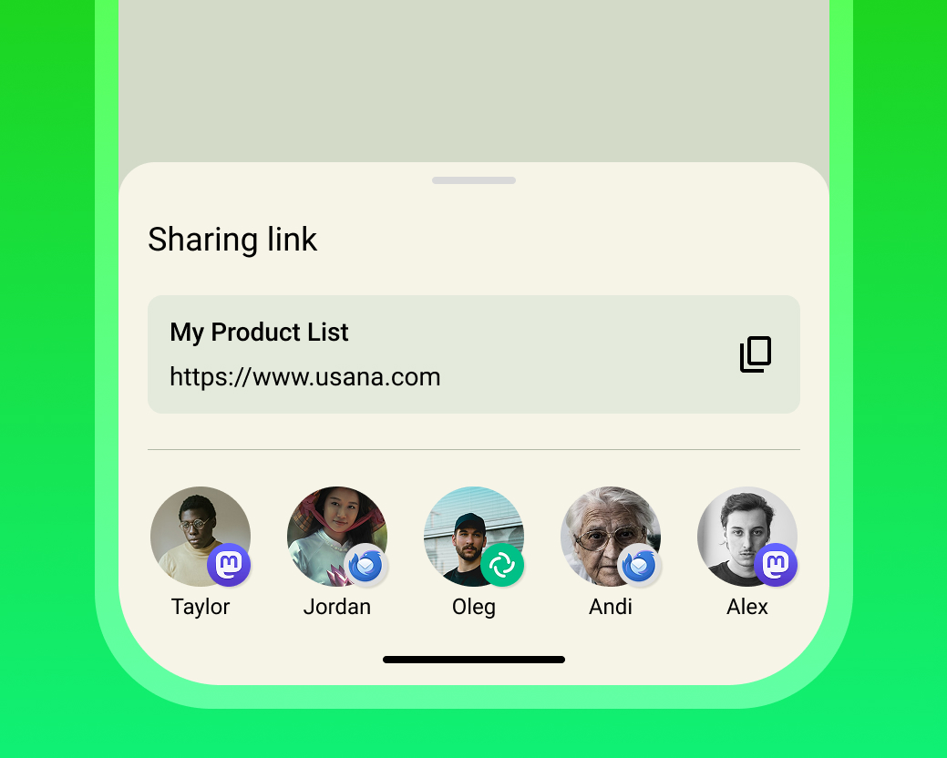
Share Sheets
Share sheets (like the one below) have become such a common interaction on mobile devices that you probably don’t think twice about what they are or how an app could build their own custom version if they really wanted to.
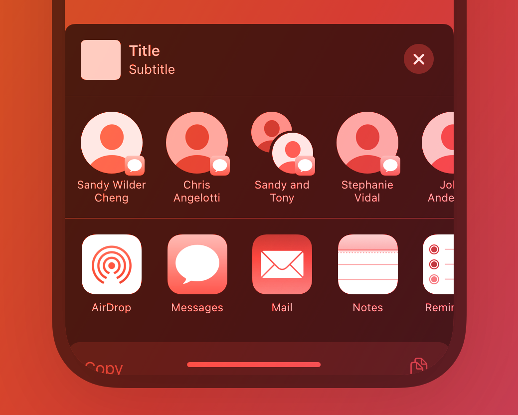
Unfortunately, Usana had been using a totally custom interface for sharing. Don’t get me wrong, I’m all for breaking things and trying new ideas to make things better, but in this situation the custom solution was worse than the default. Even more concerning is that no one at Usana seemed to know why this was used instead. Either way, here’s what that custom interface looked like.
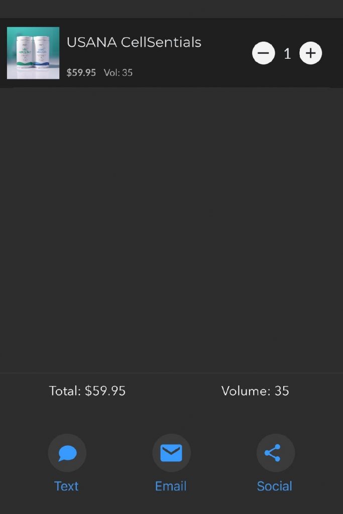
It didn’t take much for most people to get on board with this change, because the value add was clear for both users and developers! It was a big win for maturing our user experience and product development to align more with modern and natibe standards. The devs were very excited, and so was I!
Wrap Up & Handoff
Finishing Touches
As we continued to explore both the HiFi designs and prototype together we were able to solidify the experience through additional review meetings and conversations. We were on track to meet our deadlines with the app deprecation, but there wasn’t too much extra space to spare. Here’s a closer look at a more of the HiFi designs.
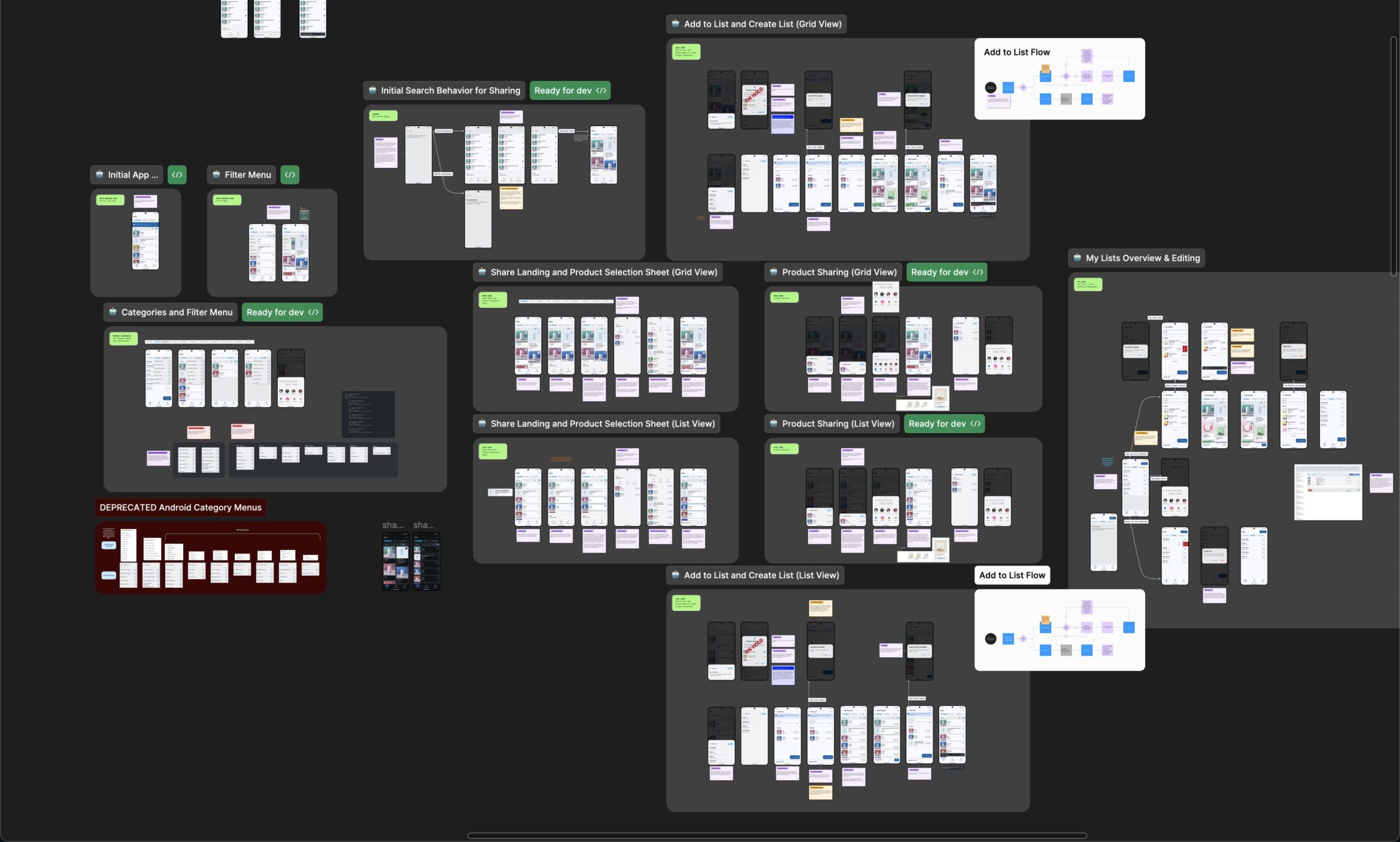
Developer Handoff
Thanks to the improved file organization and the use of an interactive prototype, the handoff to developers went smoother than ever! Here’s a snapshot of the entire file that was delivered. Like most projects there were a few unexpected design changes during development, but nothing we couldn’t handle. 💪
Outro
Impact & Learning
Not only were we able to deliver the product sharing feature set within the needed time frame, but also improved the experience in all of our focus areas! The new experience matches current mobile design patterns, modern technologies and improves both the user and developer experience. Lastly, although we didn’t have enough data analytics set up to measure user engagement or other metrics, we have heard consistently and frequently from users about how much they love the new app and how it’s changing their Usana experience in big ways!