Vibe
Brand Feeling, Core, Inspiration and Story
Brand Core
Inspiration
Fable
One Quest

leads to another
Hi there!
Curious what this whole “Simulacra” business is? Let’s get into it!
More
The design system behind One Quest is an illusory and whimsical one. The concept behind it is to highlight the illusion and mimicry of digital products. It will continuously evolve with me and my brand as I keep learning and growing which will continue to deepen the illusory nature of digital products. Is anything actually real? Is everything an illusion? Who really knows…… 🧐
Currently, it’s created using the Gutenberg Blocks editor and the Create Block Theme plugin as I learn about WordPress and build my first web experience with it. I’m familiar with building systems within Figma, Framer, and other similar tools and decided to see how the WordPress visual editor compares. The WordPress Block Theme and Gutenberg editor definitely need some big improvements like true components, variants, more override options, and many others, but it’s a decent starting place and has been fun to explore!
Inspiration
Words
Some words that inspired the theme:
Illusion, whimsy, trickster, impish, disguise, imitation
Descriptors
One Quest is:
Whimsical, playful, fresh, vibrant, fantastical, organized, simple, minimal, systematic, open, exploratory, curious, evolutionary
One Quest is not:
Traditional, sterile, plain, common, typical
Music
Music has always been a big part of my life and these lyrics inspired me to find the incredible name for my design system! 🤩
"Everything good must end
But we can live again
In the glass simulacra"

Walkway Blues
M83
Imagery
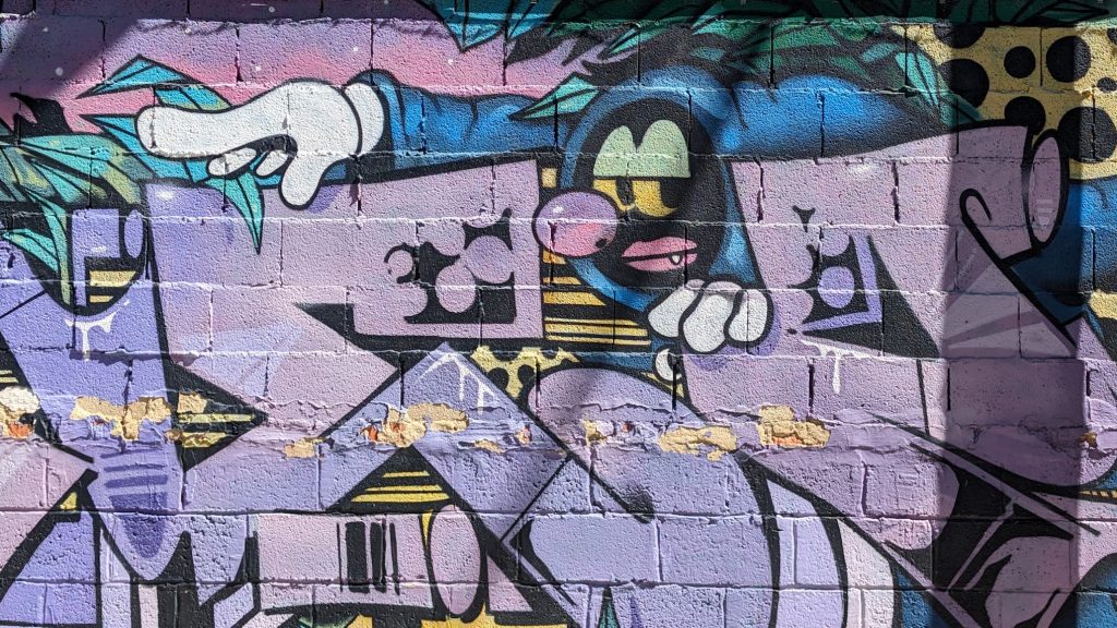
A photo I took in Spain of some really nice graffiti art. It definitely matches the vibe of One Quest and currently it’s featured as a “hero” image of sorts for the Simulacra.
What About One Quest?
Now that you know a bit more about the Simulacra, how does One Quest fit?
What is One Quest?
One Quest is the personal brand and digital identity of me, Ben Perkins. I created it after of a ton of internal questions and creative problem solving and I’m absolutely stoked to share it! 🔥
There’s a few guiding principles behind the One Quest brand and experience:
- A flexible system that evolves with me as I live
- Personalized to my interests, values, and aesthetics
- Minimal in aesthetic, structure, and all possible areas
- Using open source tools and systems (like the Fediverse and WordPress) as much as possible
One Quest isn’t a one and done thing because at it’s core it encapsulates the spirit of discovery, evolution, and change. Even now there’s so many other possibilities I’m exploring and questions I’m excited about answering! I’m just getting started.
You can think of One Quest as me in the digital realms. It’s my name, identifier, and the thing you see. Whereas the Simulacra is the system behind it all that makes it run. It gives structure, organization, cohesion, and meaning. It’s like the vibrancy and life behind One Quest. It defines how One Quest looks, feels, acts, and the things at thew core of One Quest.
Begin The Epic Simulacra Story
The wonderful and magical tales of how One Quest and the Simulacra came to be. What is it, why does it exist, and how did The Wizard create such a beautiful thing?
-
One Quest Story Intro
One Quest is my personal brand but it’s more than that. It’s also my digital identity and the beginning of a redefined digital experience and system.
The Entire Epic Story
Dive deeper into the epic story of One Quest!