Core Question
How do you design an experience when no one knows how the system actually works?
Platform
Android, iOS
Project Type
Cross-Platform Overhaul
My Role
Lead UX Designer
Tools
Figma, FigJam
Completion Time
9 Months
Team Dynamic
UX Researcher & Me
Intro
A Rare Moment Materializes
In 2024, a rare window opened at USANA to unlock one of the most important metrics for an Associate: Commissions. That window could have closed quickly with a surface-level fix, and many people were itching to do just that. But I knew we needed to dive deeper to deliver the kind of polished experience our Associates had been lacking.
What followed was a rigorous journey to understand how commissions worked across all of USANA’s 24 global markets, and an experience that gave Associates the clarity they had always deserved. When it was done, USANA never saw its internal complexity the same way again.
Jam
Finding the Knowledge Nobody Had Written Down
How complex could it really be? Here’s the honest answer: way more complex than anyone expected, including me.
The Problem
USANA’s Associates had access to plenty of commission data but couldn’t understand it or take action, and neither could the people designing their experience.
A classic design puzzle: everyone wanted improvement, but no one had defined what that meant. We all knew the commission experience was lacking what Associates needed, but whenever I asked for clarity, the info wasn’t available. No one seemed to know the answers or had space to track them down. I didn’t blame them. It was a beast of unfathomable complexity. After all, a 30-year-old company with deep technical and UX debt, operating across 24 markets, would have been tough to design for on its own.
But the real beast was hiding in plain sight. The commission logic for each of those 24 markets was almost entirely undocumented, buried in code, and known only to the people who wrote it. The rules just existed…somewhere in the system, invisible and untouchable.
It was undeniable: we needed a map, and someone who was willing to dive into the belly of the beast to make it.
Realizing I hit a dead end, I started asking a different question. Not what the logic was or where it was located, but who could help me understand it. I discovered that there was a backend developer who held the tribal knowledge; the person who had spent years encoding commission logic into systems that nobody fully understood anymore, even internally. We had multiple conversations. I asked questions, pushed on things that didn’t make sense, and brought in the mobile developers and stakeholders to build the rest.
What emerged from that conversation was something that didn’t exist before: a living map that made what was once invisible, visible.

For the first time, it all had a home. The logic and dependencies were no longer vague or unnamed. They had structure and purpose developers could build in code, users could see in messaging and CTAs, and stakeholders could finally understand across all markets. What did this actually look like?

Everyone loved it! Developers, project managers, and content writers were still referencing it months later to visualize what we knew instinctively but didn’t have words for — until now.
Lofi
Design As A Conversation Tool
With the map as our shared language, we started collectively validating and refining the pieces inside. The framework was solid and people believed in it; what remained was deciding exactly what to surface to Associates and when. While the developers dug into code checking the dependencies and logic, I focused our energies on building the messages and CTAs that would trigger from that logic. Not with documents or presentations, but with collaborative sessions focused on pushing the ideas from the map further. At this stage they were messy sketches, and that’s exactly what they needed to be.

While sketching and sharing with stakeholders and developers, I focused on a few essential questions:
- How can I see at-a-glance whether I’m commission qualified or not?
- How will I know my current status and the relevant actions I can take with that status?
- What are current barriers in this experience and how do we remove or reduce them?
These aren’t complicated questions, but nobody had asked them seriously before. Exploring them openly with visuals as our guide made it clear to everyone what we needed to build for Associates. This way of collaborating deepened something I’d noticed about my design process.
Insight
I use visual artifacts and design as conversation tools.
Because designs don’t have to be about presenting finished ideas. I’ve found that they’re often stronger when they surface gaps, explore possibilities, and invite others in. Yes, sometimes the explorations are terrible, but they’re always meaningful; even the terrible ones point us in the direction we needed to discover all along.
Taking On The Complexity Burden
One discovery I kept weaving into our conversations was how USANA had been unintentionally creating barriers for Associates who simply wanted help with their commissions. That realization shifted how stakeholders saw USANA’s role.
UX Victory
Stakeholders began to see that unresolved complexity doesn’t disappear — it flows downstream and surfaces as someone else’s problem.
That shift in thinking was huge! And it happened because the map made the invisible visible for the first time. Developers loved how it broke down backend logic and all the variant states and messaging they needed to build for users, and stakeholders finally had a shared language for a problem they didn’t even know USANA had. The beast was no longer lurking in the depths; it was among us and aiding in our quest.
Hifi
Every Detail Accounted For
We had the map, the logic, and a team that understood what we were building toward. I had intentionally explored past the limits of our current capabilities and was excited to refine every last detail.
But there was a worry underneath that excitement too: I didn’t know how much we’d actually be able to build.
Hifi was the gauntlet that would decide what would stay and what had to wait. Communicating regularly was key to making every variant, every message, and every CTA solid. Any adjustments or additions to the system needed to hold up not just visually but against the logic we’d spent weeks mapping. The result was a lot of variants. 👀

Since the required variants had already been mapped in previous phases, this phase was about giving them form. The card system was strong, so instead of exploring other options, we explored the structure and styles inside.

What made this card stand out from everything else we explored?
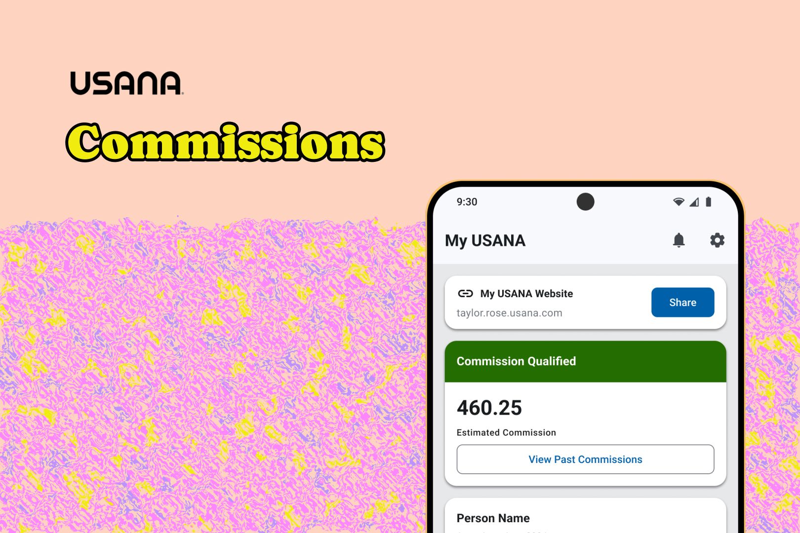
It’s all about hierarchy
Qualification Status
Determines the state of all the content below and needs to be prominent at all times. Lands at the top.


Amount & Date
The primary info Associates look for. Can change based on the qualification status or commission details. The structure remains stable while the values shift. Lands in the middle.
Message & CTA
Gives Associates the context and actions they never had before we mapped the previously invisible logic. Each variant can shift in height because the content is highly variable. Lands at the bottom.

Anchoring the elements like this ensured a clean and logical flow. The most stable and commonly used information at the top, and the most variable at the bottom. In this way, the full card could adjust in height without making the experience feel like a moving target. Bonus: ending with the CTA meant Associates always finished with a clear next step.
With a stable design in place, I connected with our content writer to establish specific messaging for each variant. Getting them to match their weight required the same rigor we’d applied to everything else. These words were the thread connecting the map to the Associates it was built for.

Constrained But Not Compromised
But not everything we designed could be built for launch. The clearest example of this was the messaging and CTAs for unqualified Associates. Before this project, they had little visibility into their qualification status, and even less guidance on what to do when their status changed unexpectedly.
However, in almost every case, everything they needed was well within their grasp; we just needed to give it to them.
After all, this was the purpose of making the messaging and CTAs visible. But after further validation, we realized that the technology to support all the variants wasn’t ready yet. 🫠 Fortunately, the map was built to be flexible, and we had everything we needed to quickly adjust.

It wasn’t the ideal, but it wasn’t a surrender either! I documented both versions, not to complain, but because ideas that don’t launch aren’t dead, they’re waiting. Documenting them clearly meant the conversation didn’t start from scratch. And sometimes, when people can see past the current constraints, they won’t just dream bigger, they’ll build.
Designing Beyond The First Impression
Sadly, UX Research at USANA was still an afterthought for many projects. 🥲 But one of our amazing UX Researchers reached out anyway, and I needed it. I was stuck in an iteration loop and couldn’t pinpoint what to change. Without a budget or official inclusion, we ran scrappy tests with a few employees who had relevant domain knowledge. Not a perfect sample, but real people reacting to real designs.
The tests surfaced two clear findings
1
The commission amount was getting lost or missed because it didn’t have enough visual weight
2
A banner that’s always visible trains people to ignore it, regardless of status changes

Making the commission text bolder solved the first issue, but the banner blindness was more challenging. We explored swapping with badges, but they still risked becoming visual noise that would get tuned out. Not knowing what to do, I set up a review with the full UX team and they had exactly what I needed.
I’d been treating the banner and the badge as competing solutions, one or the other. It was during the review that someone connected the dots I had missed: what if both existed together? The banner would appear and stay for a limited time when commission status changed; once stabilized, the badge would take over. Prominent when it matters and quiet when it doesn’t. A banner system designed to make banner blindness irrelevant.

We weren’t designing only for the first time a user would see this. We were designing for the tenth, or even the fiftieth. However many times an Associate needed commission info, we’d be there. Communicating clearly and providing next steps.
By this point, the three core elements we’d been building toward the whole time were more clear than ever:
- At-a-glance qualification status, amount, and next pay date
- Relevant messaging for every scenario based on the logic we’d mapped
- Contextual CTAs to help Associates either explore or unblock themselves
These 3 things didn’t show up out of nowhere. We earned them.
Remix
Building Systems Over Solutions
As the year wrapped up, company priorities shifted toward an aggressive new initiative. The commission project got folded in with a much tighter timeline than anyone had planned for, and we scaled back to match. Months of work suddenly reduced in scope is the kind of thing that can feel like a defeat.
But it wasn’t a defeat. Because we’d built a foundation, not just a feature.
The decisions we made, the documentation we created, the commission logic that was finally mapped and visible. All of it positioned USANA to be flexible with the launch while staying focused on what it would eventually become. That’s the difference between solving the immediate problem and solving the underlying one.

Outro
The Firsts Nobody Planned For
The scaled back launch didn’t diminish what we’d built. If anything, it made the firsts we achieved more remarkable.
For the first time, USANA had something better than documentation: it had a detailed map of how commissions worked across all 24 markets. But the best part? What USANA was able to do with the map. It created a shared language for stakeholders, developers, and anyone else who needed a peek behind the curtain, and that language changed something. It turned what had felt impossible into something worth building together: an experience for Associates that finally gave them the power to understand and act on their commissions.
What this project reinforced for me
1
The most rigorous work often happens before Figma opens. In the conversations, the architecting, and naming the unnamed.
2
Refusing to accept “this is just how it works” is sometimes the most difficult and valuable design decision to make.
3
Visual artifacts don’t just communicate ideas. In certain moments, they change how an entire organization sees a problem.