I’ve thought for so many years that Google could have had a much more powerful rebrand for its many app icons if it did something like this:
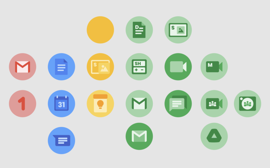
I designed these icons a few years ago to match the beautiful new Chrome OS icons that we’re coming out, cuz I loved the aesthetic so much! Then Material You came out and it felt like this style was the perfect match for the next iteration of Google’s design system, and I’ve always been confused why they decided to go with their confusing multicolored icons instead.
Like c’mon, this other style has so much more character and life! 🤩
Replies