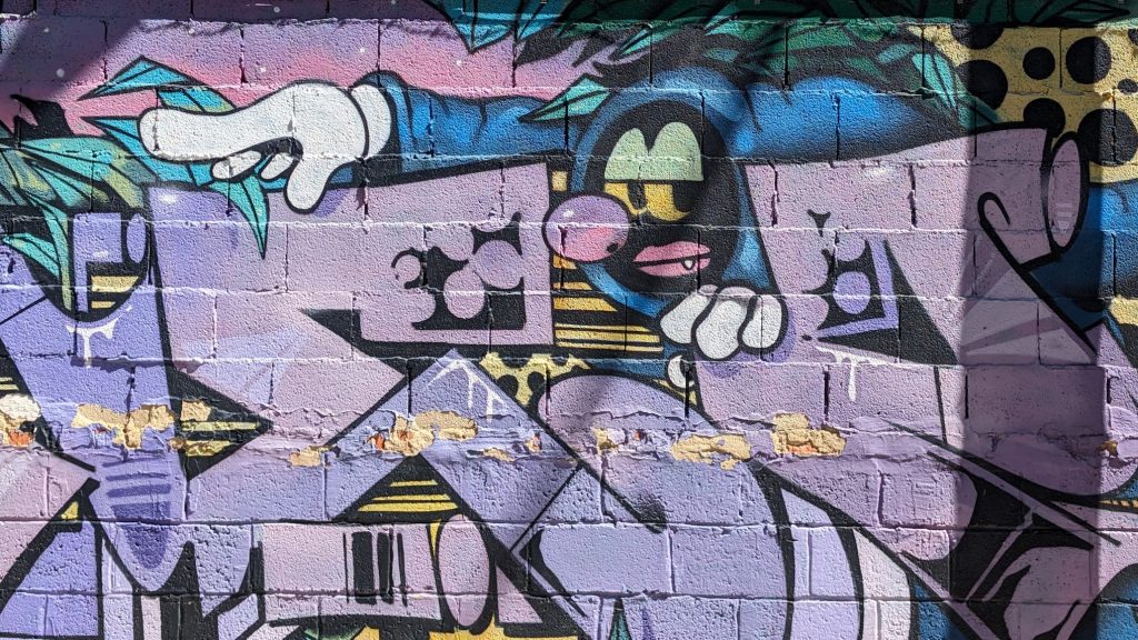
An Enchanting Grimoire

  • Since the beginning of creating this digital experience that is “One Quest” I’ve been so excited to craft a space that helps me share what I’m creating, exploring, and questioning in real time. I think it’s so cool to follow along on people’s journeys of exploration and creation. But it can be difficult to do that if all you get is long form posts every once in a while. There’s so much that happens in the in between of those posts and so many smaller pieces that lead to those polished artifacts of design! That’s what I want to showcase with One Quest. I’m still planning to have longer articles that dive deep into a specific area, and I think these two things will compliment each other really well. It’s something I’ve felt is missing from my design documentation/posts, and also something I would be so stoked to see more people in the design space adopt so that we can enjoy each others amazing creations more frequently. I also like that it’s a way to get into the rougher pieces of design. Random sketches, notes, questions and all sorts of things as they’re forming.

    I’ve been exploring calling this space “Runes”, because it’s like a tiny piece of magic or spells. I don’t know if this will be the permanent name and I’m still lost with how to organize it alongside other post types and formats right now.

    We’ll see if I can get there. I think I can. But this post is a reminder and a relief for myself to be okay with it not being what I want yet. To let myself breathe and also to keep pushing for what I want to to be when the pieces are in place. Soon….very soon!

    It’s been fun exploring open source design collaboration with people helping build F-Droid. Here’s some sketches that I made to communicate potentially design options for an upcoming app store design update to Material 3.

  • View Post: Third Page

    Trying to decide how I want to organize and design the third page of One Quest. It’s gone through many iterations but is currently called “Notes”, which was a temporary placeholder name while I work on the branding, design, IA, and many other pieces.

    Also not sure if I want just micro blogging posts and images, or maybe if I also want longer form articles. Like maybe I can do a monthly kind of update thing that’s more thoughtful and detailed (but not too much cuz who wants to read that much 🤪).

  • View Post: /e/OS

    Got eOS running on a spare Android I had put LineageOS on last year. The web installer was SO much better than how I had to install Lineage with the terminal. Still some work to improve the user experience of it, but nicely done overall!

    I like a lot of the things eOS is doing, but they’re leaning more into iOS patterns more than I thought as well which is disappointing and frustrating. Things like swipe down on home to bring up search, the app grid not being flexible (this is such a basic thing Android has had for so long, and I think even iOS changed their’s now?), and the swipe-left-on-home panel that looks suspiciously too much like iOS control center. Plus, only letting widgets be there instead of anywhere?

    I hope they can keep differentiating their visual design language, UX interactions and other things to feel more open and customizable. I do like the personalizable font, icon, and other customization options that core Android removed a few years ago though, so props for that!

  • I seriously think it would be so cool if all tech was built around the modular, scalable concept of federation and open standards that everyone can use! Like, seriously, why is this not how we built it from the beginning??

    For example, wouldn’t it be so cool if instead of needing to have an account with this shop, and an account with this other one, and I can only save certain products in one or another, I just have an open wishlist that’s tied to my digital identity and every shop can be federated and connected to the same standards so that wherever I am I can connect with shops and add products and purchase them from my identity. I don’t need to have a fragmented amalgamation of digital identities and experiences. Please can we federate everything digital??

  • The new passthrough charging feature for Android is such a dream come true that I didn’t expect would ever come!! It’s the perfect addition for building my future computer setup with my favorite Android computer. 😁😍 I’m still in the early stages of testing, but things are coming along really well, and once Android’s full desktop experience launches the passthrough charging will be the perfect way to use my Android as a home computer without every worrying that the battery is getting overused or worn down!! I’ve been trying it on my Espresso display and it’s such a dream! Thank you Google!

  • I’ve thought for so many years that Google could have had a much more powerful rebrand for its many app icons if it did something like this:

    I designed these icons a few years ago to match the beautiful new Chrome OS icons that we’re coming out, cuz I loved the aesthetic so much! Then Material You came out and it felt like this style was the perfect match for the next iteration of Google’s design system, and I’ve always been confused why they decided to go with their confusing multicolored icons instead.

    Like c’mon, this other style has so much more character and life! 🤩

  • Since the beginning of creating this digital experience that is “One Quest” I’ve been so excited to craft a space that helps me share what I’m creating, exploring, and questioning in real time. I think it’s so cool to follow along on people’s journeys of exploration and creation. But it can be difficult to do that if all you get is long form posts every once in a while. There’s so much that happens in the in between of those posts and so many smaller pieces that lead to those polished artifacts of design! That’s what I want to showcase with One Quest. I’m still planning to have longer articles that dive deep into a specific area, and I think these two things will compliment each other really well. It’s something I’ve felt is missing from my design documentation/posts, and also something I would be so stoked to see more people in the design space adopt so that we can enjoy each others amazing creations more frequently. I also like that it’s a way to get into the rougher pieces of design. Random sketches, notes, questions and all sorts of things as they’re forming.

    I’ve been exploring calling this space “Runes”, because it’s like a tiny piece of magic or spells. I don’t know if this will be the permanent name and I’m still lost with how to organize it alongside other post types and formats right now.

    We’ll see if I can get there. I think I can. But this post is a reminder and a relief for myself to be okay with it not being what I want yet. To let myself breathe and also to keep pushing for what I want to to be when the pieces are in place. Soon….very soon!

    It’s been fun exploring open source design collaboration with people helping build F-Droid. Here’s some sketches that I made to communicate potentially design options for an upcoming app store design update to Material 3.

  • View Post: Third Page

    Trying to decide how I want to organize and design the third page of One Quest. It’s gone through many iterations but is currently called “Notes”, which was a temporary placeholder name while I work on the branding, design, IA, and many other pieces.

    Also not sure if I want just micro blogging posts and images, or maybe if I also want longer form articles. Like maybe I can do a monthly kind of update thing that’s more thoughtful and detailed (but not too much cuz who wants to read that much 🤪).

  • View Post: /e/OS

    Got eOS running on a spare Android I had put LineageOS on last year. The web installer was SO much better than how I had to install Lineage with the terminal. Still some work to improve the user experience of it, but nicely done overall!

    I like a lot of the things eOS is doing, but they’re leaning more into iOS patterns more than I thought as well which is disappointing and frustrating. Things like swipe down on home to bring up search, the app grid not being flexible (this is such a basic thing Android has had for so long, and I think even iOS changed their’s now?), and the swipe-left-on-home panel that looks suspiciously too much like iOS control center. Plus, only letting widgets be there instead of anywhere?

    I hope they can keep differentiating their visual design language, UX interactions and other things to feel more open and customizable. I do like the personalizable font, icon, and other customization options that core Android removed a few years ago though, so props for that!

  • I seriously think it would be so cool if all tech was built around the modular, scalable concept of federation and open standards that everyone can use! Like, seriously, why is this not how we built it from the beginning??

    For example, wouldn’t it be so cool if instead of needing to have an account with this shop, and an account with this other one, and I can only save certain products in one or another, I just have an open wishlist that’s tied to my digital identity and every shop can be federated and connected to the same standards so that wherever I am I can connect with shops and add products and purchase them from my identity. I don’t need to have a fragmented amalgamation of digital identities and experiences. Please can we federate everything digital??

  • The new passthrough charging feature for Android is such a dream come true that I didn’t expect would ever come!! It’s the perfect addition for building my future computer setup with my favorite Android computer. 😁😍 I’m still in the early stages of testing, but things are coming along really well, and once Android’s full desktop experience launches the passthrough charging will be the perfect way to use my Android as a home computer without every worrying that the battery is getting overused or worn down!! I’ve been trying it on my Espresso display and it’s such a dream! Thank you Google!

  • I’ve thought for so many years that Google could have had a much more powerful rebrand for its many app icons if it did something like this:

    I designed these icons a few years ago to match the beautiful new Chrome OS icons that we’re coming out, cuz I loved the aesthetic so much! Then Material You came out and it felt like this style was the perfect match for the next iteration of Google’s design system, and I’ve always been confused why they decided to go with their confusing multicolored icons instead.

    Like c’mon, this other style has so much more character and life! 🤩

Tenets
Most Formidable Strengths
Most Dire Flaws

What happens next on your magical adventure?

Designed & built with pocket computers

Proudly powered by WordPress Gutenberg

Tenets
Most Formidable Strengths
Most Dire Flaws

What happens next on your magical adventure?

Designed & built with pocket computers

Proudly powered by WordPress Gutenberg